Page History
| Anchor | ||||
|---|---|---|---|---|
|
| Table of Contents | ||||
|---|---|---|---|---|
|
Overview
The following sections outline sample dashboard content developed with DashXML and Yellowfin content. It will explore each of the avilalbe widget types, how they were set up in the XML, and how they were styled through custom CSS.
Note: this is merely a guide in order to walk you through using the DashXML framework for your own dashboard requirements.
The main XML widget types consist of the following:
| Code Block | ||||
|---|---|---|---|---|
| ||||
<application-definition> <sourcefilter></sourcefilter> <dashboard> <text></text> <exportlist> <export><export> </exportlist> <filter> <options> <summary><summary> </options> </filter> <report> <modal> <subcontent></subcontent> </modal> <filterMap></filterMap> </report> <modal> <subcontent></subcontent> </modal> <customhtml> <replacements></replacements> </customhtml> <subtab> <options> <subcontent></subcontent> <summary></summary> </options> <subtab> </dashboard> </application-definition> |
The full XML structure is outlined on the Widget XML page.
Dashboard Widget
| Styleclass | ||
|---|---|---|
| ||
Sub Tab Widget
| Styleclass | ||
|---|---|---|
| ||
Dashboard Widgets are used to define the contents of each page in order to produce a dashboard. The dashboard will hold all other widgets to be displayed, called, or used on a page. It can contain as many reports as required, each styled be its own CSS class, as well as allowing for styles to be applied to the dashboard as a whole.
Example Output
Example Elements
| Expand |
|---|
|
| ||
|
|
| Expand |
|---|
|
Text Widget
| Styleclass | ||
|---|---|---|
| ||
<text> XML Widget. This will simply need to contain the text to be displayed as the title, and a css class name to be used for styling that text.Example Output

Example Elements
| Expand | |||||||||
|---|---|---|---|---|---|---|---|---|---|
|
Example XML
|
Example XML
| Expand | |||||||
|---|---|---|---|---|---|---|---|
| |||||||
| Expand | |||||||
|
Example CSS
| Expand | |||||||
|---|---|---|---|---|---|---|---|
|
Export Button Widget
| Styleclass | ||
|---|---|---|
| ||
<exportlist> XML Widget. This will need to define which export formats you wish to allow, and which report to export (if you are using XLS).Example Output

Example Elements
| Expand | ||||||||||||||||||||||||||||||||||||
|---|---|---|---|---|---|---|---|---|---|---|---|---|---|---|---|---|---|---|---|---|---|---|---|---|---|---|---|---|---|---|---|---|---|---|---|---|
|
Example XML
| Expand | |||||||
|---|---|---|---|---|---|---|---|
|
Example CSS
| Expand | |||||||
|---|---|---|---|---|---|---|---|
|
|
Sub Tab Widget
| Styleclass | ||
|---|---|---|
| ||
Example Output

Example Elements
| Expand | ||||||||||||||||||||||||
|---|---|---|---|---|---|---|---|---|---|---|---|---|---|---|---|---|---|---|---|---|---|---|---|---|
<subtab>
<options>For within a sub tab.
|
Example XML
| Expand | |||||||
|---|---|---|---|---|---|---|---|
|
Example CSS
| Expand | |||||||
|---|---|---|---|---|---|---|---|
|
Text Widget
| Styleclass | ||
|---|---|---|
| ||
<text> XML Widget. This will simply need to contain the text to be displayed as the title, and a css class name to be used for styling that text.Example Output
Example Elements
| Expand | |||||||||
|---|---|---|---|---|---|---|---|---|---|
|
Example XML
| Expand | |||||||
|---|---|---|---|---|---|---|---|
|
Example CSS
| Expand | |||||||
|---|---|---|---|---|---|---|---|
|
Export Button Widget
| Styleclass | ||
|---|---|---|
| ||
<exportlist> XML Widget. This will need to define which export formats you wish to allow, and which report to export (if you are using XLS).Example Output
Example Elements
| Expand | ||||||||||||||||||||||||||||||||||||
|---|---|---|---|---|---|---|---|---|---|---|---|---|---|---|---|---|---|---|---|---|---|---|---|---|---|---|---|---|---|---|---|---|---|---|---|---|
|
Example XML
| Expand | |||||||
|---|---|---|---|---|---|---|---|
|
Example CSS
| Expand | |||||||
|---|---|---|---|---|---|---|---|
|
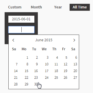
Filter Widget - Dates
| Styleclass | ||
|---|---|---|
| ||
<filter> XML widget. Each filter widget requires at least one option to be defined, allowing the user to select a value to apply. This particular filter has four options; Custom, Year, Month, and All Time. The Year, Month, and All Time filters have been set up using pre-defined date ranges, while the Custom option was specified as user prompt in order to allow users to specify a custom range.Example Output
Example Elements
<filter>
| Child | Value | Description |
|---|---|---|
| true | Setting this to true allows the values of this filter to be passed to other dashboards. |
datatype | DATE | This specifies that the filter options need to return a date type in order to be applied. |
name | dateFilter | This contains the name of the filter, to be used to identify it for the <filterMap> node used on reports receiving the values. |
operator | BETWEEN | This specifies the operator for the filter, and must be compatible with the operators used in reports you wish to pass the filter values to. BETWEEN means two values are expected. This option should be used for operators defined in the report including, but not limited to; Between, Not Between. |
styleClass | topFilter | This contains a CSS class name used to apply styling to the component. |
options | This contains nodes to define the contents of the display and possible values. Each option to be presented to the user will need to have its own <option> node. In this example we’ve used a Year, Month, and Custom option. See <options> node description. |
<options> (Custom)
| Child | Value | Description |
|---|---|---|
title | Custom | This is the label displayed on the filter. A text name describing the value that will be applied. |
| prompt | true | This specifies that the option doesn’t have a value predefined, but rather will ask the user to provide it. In this example, as we are using a prompt, there is no need for a <value> node. As the filter is defined as a date, the user will be presented with a calendar picker (which can be styled using css). |
<options> (Year)
| Child | Value | Description |
|---|---|---|
title | Year | This is the label displayed on the filter. A text name describing the value that will be applied. |
typecode | PREDEF | This defines that the option will use a predefined filter, such as a predefined date range. You will then have to specify which definition to use in the <value> node. |
value | YEARTODATE | YEARTODATE uses the predefined date range that is the first date of the current year, to the current date. |
<options> (Month)
| Child | Value | Description |
|---|---|---|
title | Month | This is the label displayed on the filter. A text name describing the value that will be applied. |
typecode | PREDEF | This defines that the option will use a predefined filter, such as a predefined date range. You will then have to specify which definition to use in the <value> node. |
value | MONTHTODATE | MONTHTODATE uses the predefined date range that is the first date of the current month, to the current date. |
<options> (All Time)
| Child | Value | Description |
|---|---|---|
title | All Time | This is the label displayed on the filter. A text name describing the value that will be applied. |
value | 1900-01-01\|2100-01-01 | This defines that the date range will be from 1st Jan 1900 to 1st Jan 2100, effectively covering all the data in this dataset. |
defaultOption | true | This specifies this option as the default selection for the dashboard. Only one <option> node can be the default, the rest should be false or omit this node. |
Example XML
| Expand | |||||||
|---|---|---|---|---|---|---|---|
|
Example CSS
| Expand | |||||||
|---|---|---|---|---|---|---|---|
|
Filter Widget
- Buttons| Styleclass | ||
|---|---|---|
| ||
Dates
These can be implemented using the <filter> XML widget. Each filter widget requires at least one option to be defined, allowing the user to select a value to apply. This particular filter has four options; Custom, Year, Month, and All Time. The Year, Month, and All Time filters have been set up using pre-defined date ranges, while the Custom option was specified as user prompt in order to allow users to specify a custom range.
Example Output

Example Elements
| Expand | ||||||||||||||||||||||||||||||||||||||||||||||||||||||||||||||||||||||||||||||||||||||||||||||||||||||||||||||||||||||||||||||||||||||||||||||||||||||||||||||||||||||||||||||||||||||||||||||||||||||||||||
|---|---|---|---|---|---|---|---|---|---|---|---|---|---|---|---|---|---|---|---|---|---|---|---|---|---|---|---|---|---|---|---|---|---|---|---|---|---|---|---|---|---|---|---|---|---|---|---|---|---|---|---|---|---|---|---|---|---|---|---|---|---|---|---|---|---|---|---|---|---|---|---|---|---|---|---|---|---|---|---|---|---|---|---|---|---|---|---|---|---|---|---|---|---|---|---|---|---|---|---|---|---|---|---|---|---|---|---|---|---|---|---|---|---|---|---|---|---|---|---|---|---|---|---|---|---|---|---|---|---|---|---|---|---|---|---|---|---|---|---|---|---|---|---|---|---|---|---|---|---|---|---|---|---|---|---|---|---|---|---|---|---|---|---|---|---|---|---|---|---|---|---|---|---|---|---|---|---|---|---|---|---|---|---|---|---|---|---|---|---|---|---|---|---|---|---|---|---|---|---|---|---|---|---|---|
|
Example XML
| Expand | |||||||
|---|---|---|---|---|---|---|---|
|
Example CSS
| Expand | |||||||
|---|---|---|---|---|---|---|---|
|
Buttons
The filter widget displays possible filter value options that the user can select from. Each option has the capacity to display a title, description, icon, and summary value – all except the title are optional.
Example Output
Example Elements
| Expand | |||||||||||||||||||||||||||||||||||||||||||||||||||||||||||||||||||||||||||||||||||||||||||||||||||||||||||||||||||||||||||||||||||||||||||||||||||||||||
|---|---|---|---|---|---|---|---|---|---|---|---|---|---|---|---|---|---|---|---|---|---|---|---|---|---|---|---|---|---|---|---|---|---|---|---|---|---|---|---|---|---|---|---|---|---|---|---|---|---|---|---|---|---|---|---|---|---|---|---|---|---|---|---|---|---|---|---|---|---|---|---|---|---|---|---|---|---|---|---|---|---|---|---|---|---|---|---|---|---|---|---|---|---|---|---|---|---|---|---|---|---|---|---|---|---|---|---|---|---|---|---|---|---|---|---|---|---|---|---|---|---|---|---|---|---|---|---|---|---|---|---|---|---|---|---|---|---|---|---|---|---|---|---|---|---|---|---|---|---|---|---|---|---|
|
Example XML
| Expand | |||||||
|---|---|---|---|---|---|---|---|
|
Example CSS
| Expand | |||||||
|---|---|---|---|---|---|---|---|
|
Report Widget
| Styleclass | ||
|---|---|---|
| ||
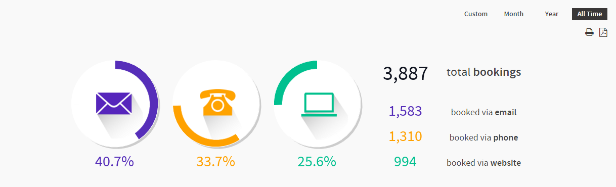
Chart
Reports and visualisations can be displayed using the <report> XML widget. This will need to call the required report, specify the format and styling, and pass through any filters.
Example Output

Example Elements
| Expand | |||||||||||||||||||||||||||
|---|---|---|---|---|---|---|---|---|---|---|---|---|---|---|---|---|---|---|---|---|---|---|---|---|---|---|---|
|
Example XML
| Expand | |||||||
|---|---|---|---|---|---|---|---|
|
Example CSS
| Expand | |||||||
|---|---|---|---|---|---|---|---|
|
Table
Tables can be displayed using the <report> XML widget. This will need to call the required report, specify the format and styling, and pass through any filter values required.
Example Output
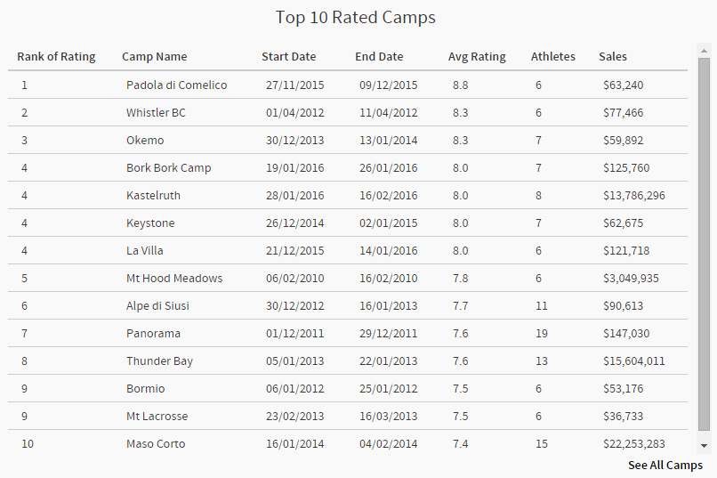
Note: the See All Camps link pictured above is called through this widget, but the contents and display of the modal is actually defined through a modal widget. See the Modal Widget section for details.
Example Elements
| Expand | |||||||||||||||||||||||||||||||||||||||
|---|---|---|---|---|---|---|---|---|---|---|---|---|---|---|---|---|---|---|---|---|---|---|---|---|---|---|---|---|---|---|---|---|---|---|---|---|---|---|---|
|
Example XML
| Expand | |||||||
|---|---|---|---|---|---|---|---|
|
Example CSS
| Expand | |||||||
|---|---|---|---|---|---|---|---|
|
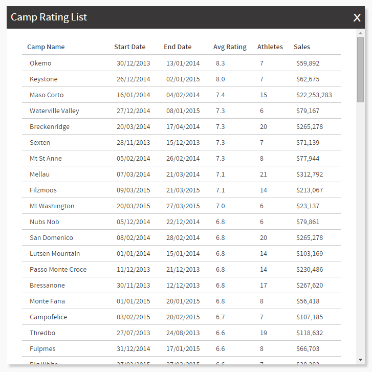
Modal Window Widget
| Styleclass | ||
|---|---|---|
| ||
<subcontent> element. The modal itself is called outside of the <modal> definition, for example as part of a report. For the purpose of this scenario, we have defined the modal link as part of a report (see Table outline above).Example Output
Example Elements
| Expand | |||||||||||||||||||||||||||||||||||||||||||||
|---|---|---|---|---|---|---|---|---|---|---|---|---|---|---|---|---|---|---|---|---|---|---|---|---|---|---|---|---|---|---|---|---|---|---|---|---|---|---|---|---|---|---|---|---|---|
|
Example XML
| Expand | |||||||
|---|---|---|---|---|---|---|---|
|
Example XML
| Expand | |||||||
|---|---|---|---|---|---|---|---|
|
Example CSS
| Expand | |||||||
|---|---|---|---|---|---|---|---|
|
Example CSS
| Expand | |||||||
|---|---|---|---|---|---|---|---|
|
Report Widget
| Styleclass | ||
|---|---|---|
| ||
Example Output
Example Elements
| Expand |
|---|
|
Example XML
| Expand |
|---|
|
Example CSS
| Expand |
|---|
|
|
Custom HTML
Modal WindowWidget
| Styleclass | ||
|---|---|---|
| ||
Example Output
Example Elements
| Expand |
|---|
|
Example XML
| Expand |
|---|
|
Example CSS
Text & Report Data
| Class | topLink |
|---|
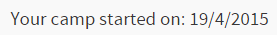
The data from a report can be used within a <customHTML> XML Widget along with other elements to produce a combined output. In this scenario, we wanted to display the first date we have records for within the user selected filter date range. To do this we wanted to combine some static text with a date record from a report. The widget needed to contain HTML to display the static text, such as "Your camp started on: ", and the dynamic date element that comes from the result of a Yellowfin report. In order to do this, you will also need to include the report that returns the date as a hidden report.
Example Output
Example Elements
| Expand | |||||||||||||||||||||||||||||||||||||||||||||
|---|---|---|---|---|---|---|---|---|---|---|---|---|---|---|---|---|---|---|---|---|---|---|---|---|---|---|---|---|---|---|---|---|---|---|---|---|---|---|---|---|---|---|---|---|---|
|
Example XML
| Expand | |||||||
|---|---|---|---|---|---|---|---|
|
Example CSS
| Expand | |||||||
|---|---|---|---|---|---|---|---|
|
Custom HTML Widget
| Styleclass | ||
|---|---|---|
| ||
Example Output
Example Elements
| Expand |
|---|
|
Example XML
| Expand |
|---|
|
Example CSS
expand
| horizontalrule |
|---|
| Styleclass | ||
|---|---|---|
| ||