In this section we will look into the features and functionalities available on the different screens of our iOS app.
Navigating the Dashboard
On successfully logging in to your Yellowfin app, the first screen you will view is the app's home screen. Following is an example of what that screen looks like:
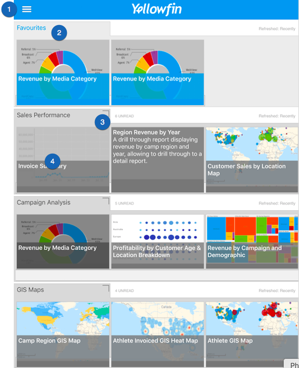
Below is a description of each of the features of this home screen:
| No. | Features | Description |
|---|---|---|
| 1. | Main menu | Expands to reveal the main navigation menu of this app. See below for more details on the options of this menu. |
| 2. | Favourites | A seperate panel that shows all the reports and charts that have been marked as favourite. |
| 3. | View dashboard | The icon at the top-right edge of a dashboard thumbnail is used to view that dashboard. |
| 4. | View reports and charts | You can also directly view a report or chart by clicking on one. |
Main Menu
Click on the main menu icon on the left side, to see the features of this menu. Here's what it looks like when expanded:
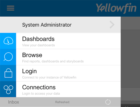
| Features | Description |
|---|---|
| User profile | Click on your username to view the profile |
| Dashboards | This redirects you to the dashboard screen at any time. |
| Browse | Use the browse screen to search for dashboards, storyboards and reports. |
| Login | This feature is used to log in to the app. You can use it to log in as another user if you have multiple accounts. |
| Connections | Use this button to establish connections to your data sources. |
Understanding the Dashboard Features
A Look into the Report Detail Screen
Clicking on a report or a chart will take you to a screen with its details. Here's an example of what it looks like, along with a description of it's features.
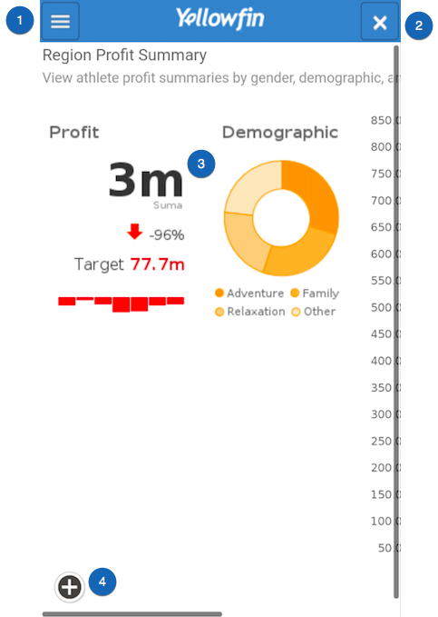
Following are brief descriptions of the features of the report screen:
| No. | Features | Description |
|---|---|---|
| 1. | Report menu | This icon expands to reveal the report menu. See below for more details on the options of this menu. |
| 2. | Exit report | This button closes the report screen and returns you to the home page. |
| 3. | Report details | The main details of the report or chart are seen on this canvas. |
| 4. | Options button | This plus button is used to reveal a number of options that you can perform on the report. See below for more information. |
Report Menu
Click on the report menu icon on the left side to see its options. Here's what it looks like when expanded:
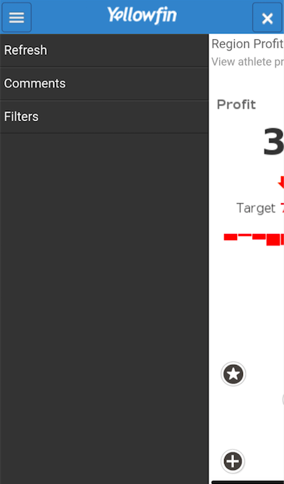
| Features | Description |
|---|---|
| Refresh | Click on this option to refresh the report screen. |
| Comments | This button allows you to view the comments made on this report. |
| Filters | This shows the filters added to this report. (Note: These are user created filters, that are included when creating the report.) |
Report Options
Clicking on the plus button reveals the following report options:
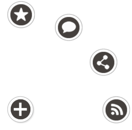
| Icon | Features | Description |
|---|---|---|
| Favourite | Use this button to mark the report as favourite. | |
| Comment | Use this to add a comment to the report. | |
| Share | Use this to share the report with other Yellowfin users. | |
| Broadcast | Use this button to broadcast the report to users at scheduled intervals. |
Click here to learn how to perform various functions using these features.