Overview
Adding text to your dashboard can be done via Text Widgets. Choose text widgets of different sizes, or customize via the text widget properties panel. The default sizes represent typical formatting defaults, such as headlines, or paragraphs.
How to use Text Widgets
- Click on the Text Widget button on the left side of the screen.
- Drag a text widget of any size to where you wish to display it on the dashboard.
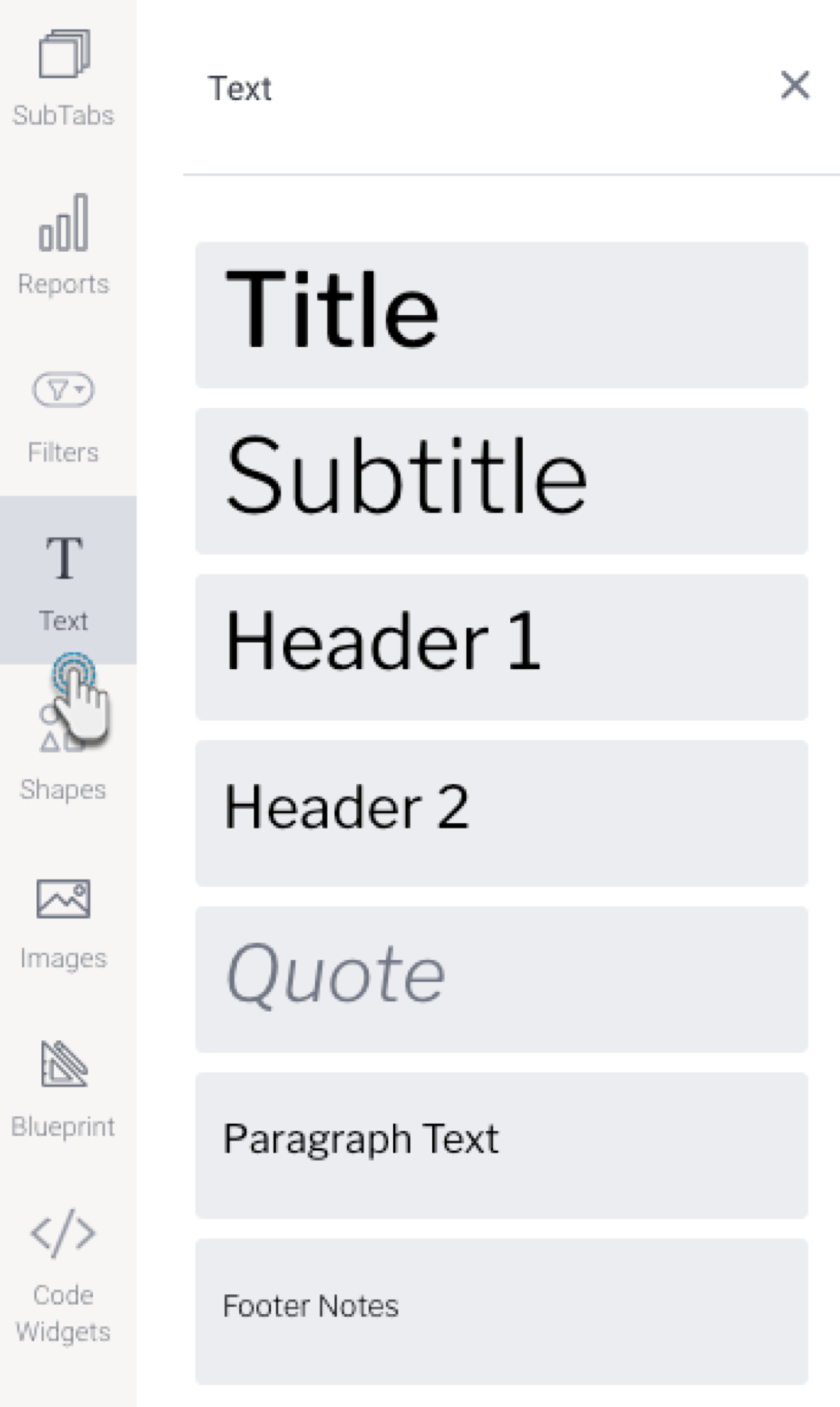
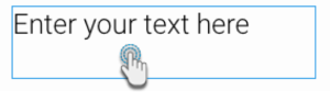
- Click on the dropped widget in the dashboard to add text that you wish to display.
- You can customize the text through the Text widget’s properties panel. This panel appears on the right side once the text widget is selected. Refer to the Properties section below to learn about the types of customization available on a text widget.
- Additional options are available by right-clicking and using the menu that appears. Learn more about the menu options here.
Text Widget Properties
The table below explains the text widget properties that can be used for customization.
Tip for customizing text font: You can apply certain changes to only the selected or highlighted text within a text widget. Once these settings are defined, they will affect any new text entered. These settings include: font type and size, color, style, opacity, indent.

Property name | Description |
|---|---|
Name | Allows you to edit the system-generated default name of the selected text widget. Tip: Giving your widget an easy name, will allow you to further customize it in Code Mode. |
Font | Lets you change the font type and size of the selected text. |
Color | Lets you specify the color of the selected text. |
Style | Allows you to apply a formatting style to the selected text. Options include bold, italic, and underlined. |
Alignment | Allows you to align the contents of the text widget. |
Opacity | Allows you to define the transparency (see-through) of the selected text. The lower the number on this slider, the more transparent the text will be. |
Indent | Allows you to add or remove indentation within the text. |
List style | Allows you to add numbered or bullet point lists to the text. |
Spacing | |
Line | This allows you to define the amount of spacing between each line of content in the selected text widget. The higher the number, the more space allocated. |
Chars | This allows you to define the amount of spacing between each character in the selected text widget. The higher the number, the more space allocated. |
Size & Location | |
X | Specify the x coordinates of the top left corner of the text widget, in order to position it exactly on your dashboard canvas. |
Y | Specify the y coordinates of the top left corner of the text widget, in order to position it exactly on your dashboard canvas. |
Width | Specify the width of the text widget, in pixels, in order to resize it exactly. |
Height | Specify the height of the text widget, in pixels, in order to resize it exactly. |
Corners | This option allows you to define the roundness of your text widget border corners. Tip: For maximum circular edges, enter half the value of the widget height. For example, if the height is 400 pixels, then set the edge value to 200 pixels. Moreover, any value greater than 200 for the edge, will have no further effect in this example. |
Rotation | Specify the amount you wish to rotate your widget clockwise, in degrees. To rotate anti-clockwise, specify a negative value. |
Aspect ratio | Enable this toggle to maintain the aspect ratio. This means the widget maintains its shape, but its size can be increased or decreased. If this is disabled, the widget can be stretched out of shape either vertically or horizontally. |
Lock widget | Enable this toggle to lock the text widget in its location. This stops you from moving or resizing the widget. This holds true even when selecting multiple widgets on the canvas. Note that the text widget can still be edited. |
Background formatting | |
Background color | Allows you to specify a background color for the text widget. This refers to the area within the widget, excluding the text content. |
Opacity | Allows you to specify the transparency of the background color on the widget. |
Customise padding | This option allows you to define a custom padding or buffer around the text widget, in pixels. This includes padding for each side to the widget. If disabled, you can still define an overall padding size. |
Padding top | When custom padding is enabled, this allows you to define padding to be added to the top of the widget. |
Padding bottom | When custom padding is enabled, this allows you to define padding to be added to the bottom of the widget. |
Padding right | When custom padding is enabled, this allows you to define padding to be added to the right of the widget. |
Padding left | When custom padding is enabled, this allows you to define padding to be added to the left of the widget. |
Padding | This allows you to define an overall padding size for the text widget. This size, defined in pixels will be constant on each side of the widget. To add different sized padding on any of the sides, enable the Customise Padding option. |
Border width | This allows you to specify the thickness of the widget border. Note: to make the widget border visible, you must define values for all three border properties. |
Border style | This allows you to select a style for the widget border. Options include: dashed, solid, dotted, groove, and more. |
Border color | This allows you to specify the color of the widget border. |
Horizontal shadow | This option allows you to define the horizontal shadow size, in pixels. |
Vertical shadow | This option allows you to define the vertical shadow size, in pixels. |
Shadow blur | This option allows you to define the sharpness of the shadow. The smaller the value, the sharper and more defined the shadow will be. For a blurry or softer shadow, provide a bigger value. |
Shadow color | This option allows you to set a color for the shadow. |