Overview
The following sections outline sample dashboard content developed with DashXML and Yellowfin content. It will explore each of the avilalbe widget types, how they were set up in the XML, and how they were styled through custom CSS.
Note: this is merely a guide in order to walk you through using the DashXML framework for your own dashboard requirements.
The main XML widget types consist of the following:
<application-definition>
	<sourcefilter></sourcefilter>
	<dashboard>
		<text></text>
		<exportlist>
			<export><export>
		</exportlist>
		<filter>
			<options>
				<summary><summary>
			</options>
		</filter>
		<report>
			<modal>
				<subcontent></subcontent>
			</modal>
			<filterMap></filterMap>
		</report>
		<modal>
			<subcontent></subcontent>
		</modal>
		<customhtml>
			<replacements></replacements>
		</customhtml>
		<subtab>
			<options>
				<subcontent></subcontent>
				<summary></summary>
			</options>
		<subtab>
	</dashboard>
</application-definition>
The full XML structure is outlined on the Widget XML page.
Dashboard Widget
Sub Tab Widget
Text Widget
Export Button Widget
Filter Widget
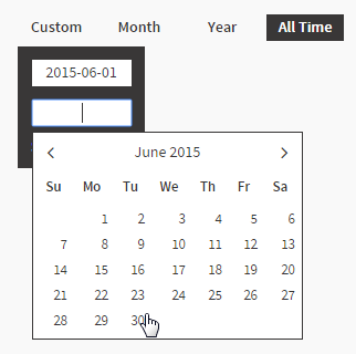
These can be implemented using the<filter> XML widget. Each filter widget requires at least one option to be defined, allowing the user to select a value to apply. This particular filter has four options; Custom, Year, Month, and All Time. The Year, Month, and All Time filters have been set up using pre-defined date ranges, while the Custom option was specified as user prompt in order to allow users to specify a custom range.Example Output
Example Elements
Example XML
Example CSS
/* Date Filters */
.topFilter {
    height: 24px;
    line-height: 24px;
    padding-top: 14px;
}

.topFilter .filterOption {
    text-align: center;
    float: right;
    color: #393737;
    cursor: pointer;
    width: 70px;
    margin-left: 5px;
    font-weight: bold;
}

.topFilter .selected {
    background-color: #393737;
    color: #FFFFFF;
}

.topFilter .filterOption .customEntry {
    background-color : #393737;
    color: #FFFFFF;
    position: absolute;
    overflow: hidden;
    z-index: 100;
    margin-top: 5px;
    width: 115px;
}

.topFilter .filterOption .customEntry  input{
    background-color : #FFFFFF;
    border: 0px;
    font-family: sourceSansPro, sans-serif;
    font-size: 14px;
    color: #393737;
    height: 24px;
    width: 70px;
    line-height: 24px;
    margin: 12px 12px 0px 12px;
    padding: 0px 10px;
    text-align: center;
}


/* Date Entry */
.submitCustom {
    float: left;
    line-height: normal;
    margin: 10px 3px 10px 12px;
}

.cancelCustom {
    float: right;
    line-height: normal;
    margin: 10px 12px 10px 3px;
}

/* Date Picker */
.ui-datepicker {
    background-color : #FFFFFF;
    border: 1px solid #393737;
    color: #393737;
    font-family: sourceSansPro, sans-serif;
    font-size: 14px;
    margin-top: 5px;
}

.ui-datepicker a{
    color: #393737;
}

.ui-datepicker .ui-datepicker-prev {
    left: 10px;
    top: 6px;
}

.ui-datepicker .ui-datepicker-next {
    right: 10px;
    top: 6px;
}

.ui-datepicker .ui-datepicker-prev:before {
    content: "\f104";
    color: #393737;
    display: inline-flex;
    font-family: FontAwesome;
    font-style: normal;
    font-weight: normal;
    -webkit-font-smoothing: antialiased;
    -moz-osx-font-smoothing: grayscale;
    font-size: 18px;
    cursor: pointer;
}

.ui-datepicker .ui-datepicker-next:before {
    content: "\f105";
    color: #393737;
    display: inline-flex;
    font-family: FontAwesome;
    font-style: normal;
    font-weight: normal;
    -webkit-font-smoothing: antialiased;
    -moz-osx-font-smoothing: grayscale;
    font-size: 18px;
    cursor: pointer;
}

.ui-datepicker .ui-datepicker-prev-hover:before {
    content: "\f104";
    color: #393737;
    display: inline-flex;
    font-family: FontAwesome;
    font-style: normal;
    font-weight: normal;
    -webkit-font-smoothing: antialiased;
    -moz-osx-font-smoothing: grayscale;
    font-size: 18px;
    cursor: pointer;
}
.ui-datepicker .ui-datepicker-next-hover:before {
    content: "\f105";
    color: #393737;
    display: inline-flex;
    font-family: FontAwesome;
    font-style: normal;
    font-weight: normal;
    -webkit-font-smoothing: antialiased;
    -moz-osx-font-smoothing: grayscale;
    font-size: 18px;
    cursor: pointer;
    text-align: right;
}

.ui-datepicker .ui-datepicker-prev-hover {
    left: 10px;
    top: 6px;
}

.ui-datepicker .ui-datepicker-next {
    text-align: right;
}

.ui-datepicker .ui-datepicker-next-hover {
    right: 10px;
    top: 6px;
    text-align: right;
}