Overview
Instant Insights are enabled via the Auto Analyse option available in the tooltip. This leads to two options: Explain and Compare. Refer to the procedures below to understand how both of these work.
- This feature is not available for all chart types.
- Only users with the appropriate role functions are able to access this feature. Learn more about these roles here.
- The system administrator needs to configure the underlying View to make Instant Insights available for business users. This guide shows how to do that.
Explain
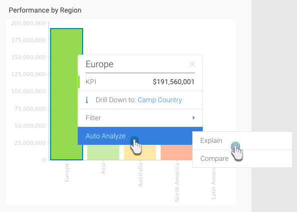
Using this option, Yellowfin will explain the underlying data drivers that impact the particular metric you have chosen. For example, in our example below, the business user has selected Sales for Europe and then chosen the Explain option from the tooltip. Yellowfin will access additional data elements from the underlying data view, and then run a series of algorithms to determine statistically relevant insights and present these back to the user.
- Locate the chart that you want to analyse (perhaps there is a spike or pattern in the data that you are interested in).
- Right-click on a chart element (bar, data point) or hover your cursor over it to bring up the tooltip.
- Click on the Auto Analyze option, and then select Explain.
A new Auto Analysis panel will appear, displaying the results of the analysis process. These insight results will be displayed in order of statistical relevance.
The chart type selected by Yellowfin depends on the type of data. For example, if the values are both metrics, then a scatter plot graph will be generated.
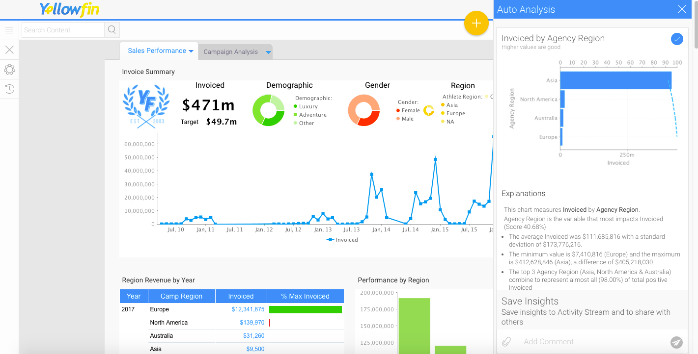
- A narrative explanation is also provided with each of the charts, allowing you to better interpret the results of the analysis.
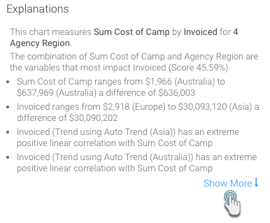
- Click on Show More at the end of the explanations, to view the complete set of narratives that are provided with your insight.
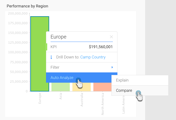
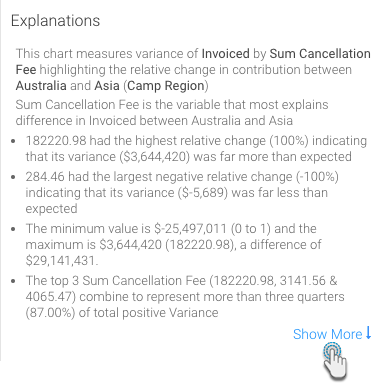
Compare
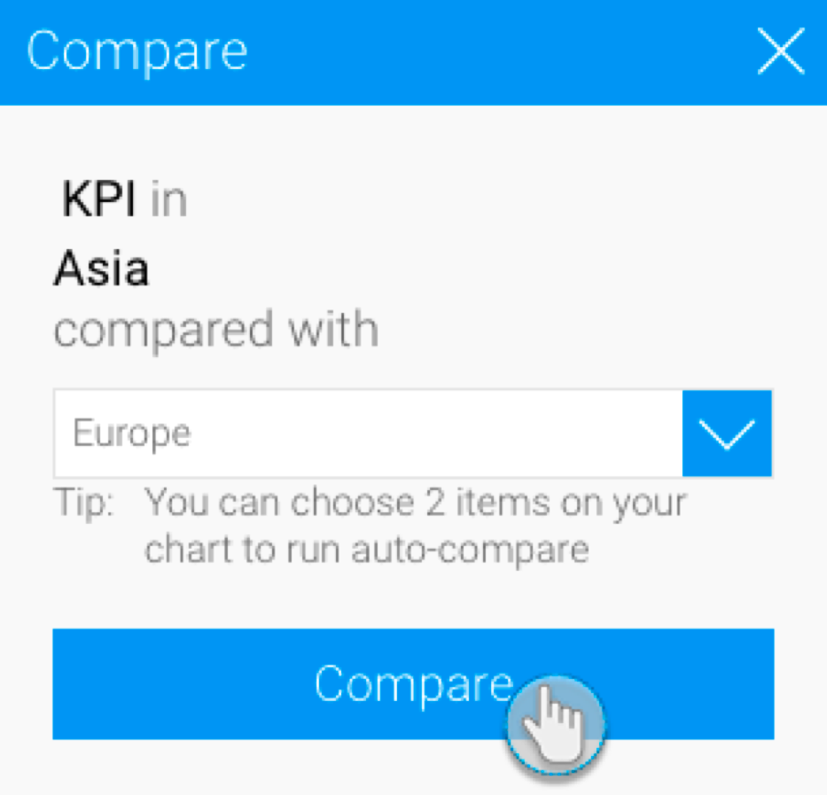
Using this option, Yellowfin will analyse the data that best explains the difference in values for a particular metric between two dimension or date values. For example, in the screen shot below – the business user has selected Sales for Asia and then chosen the Compare option from the tooltip. The user can then compare Asia to another region. Yellowfin will access additional data elements from the underlying data view, and then run a series of algorithms to determine statistically relevant drivers of difference and present these back to the user. The steps are:
- Navigate to the chart that you want to analyse (perhaps there is a large difference between two elements on a chart that you are interested in exploring).
- Right-click on a chart element (bar, data point) or hover your cursor over it to bring up the tooltip.
- Click on the Auto Analyze option, and then select Compare.
- Select the data that you want to compare to from the list in the popup that appears.
- Click on the Compare button.
- Note: Alternatively, you can select two bars to compare by clicking and dragging the cursor over them (brushing).
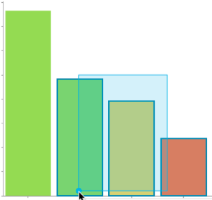
- Or, clicking on one, pressing the Shift key and selecting the other one.
- Note: Alternatively, you can select two bars to compare by clicking and dragging the cursor over them (brushing).
- The result of the comparison will appear in an Auto Analysis panel displaying charts with explanations, based on your selected data.
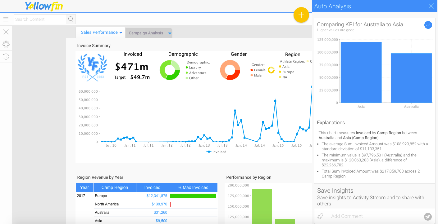
- Click on Show More at the end of the explanations, to view the complete set of narratives that are provided with your insight.
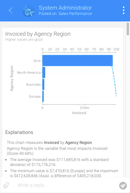
Sharing Insights
Once insights appear in the Auto Analysis panel, you can save these to the activity stream be used later, or to share them with other users.
- Choose the insights that you wish to save
- Insights can be saved or shared using the Save Insights section at the bottom of the Auto Analysis panel.

- Enter a comment.
- You can also attach a file by using the attachment icon.
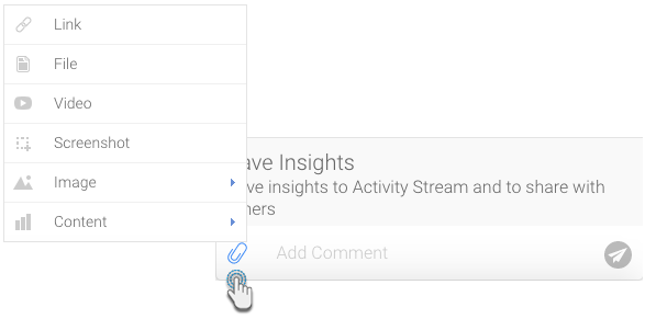
Then click on the send icon.

This will be added to the activity stream of the chart or dashboard. Click here to learn more about this.
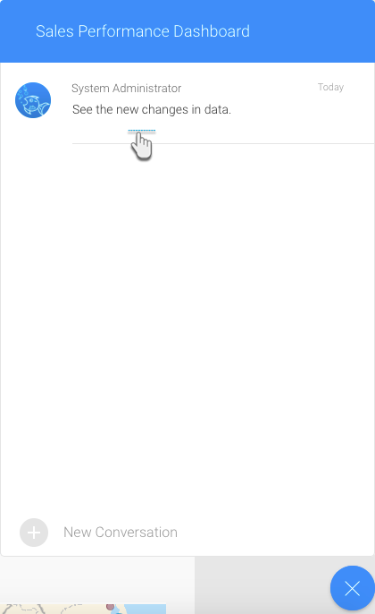
- Click on this comment to view the saved insights in the activity stream.