Overview
Type | Icon | When to Use |
|---|---|---|
Pie |
| You want to show the relationship of parts to the whole. Use a pie chart to highlight proportions rather than actual values. If it is important to show actual values in the chart, avoid using the pie chart type. |
3D Pie |
| Similar to the pie chart, but in three a dimensional form. |
Multi Pie |
| Used to highlight individual component sizes in a system of multiple components. |
Ring |
| Similar to the pie chart, but in a circular ring form. |


Chart Data Options
Option | Description |
|---|---|
Colour | This is the category label for the X axis |
Size | Typically a numeric value such as $. An item that you want to measure on your Chart |
Pie Chart Tutorial
Summary
In order to set up a Pie Chart you will need:
- Create a report with chart display
- Select a field to use as the Colour
- Select a field to use as the Size
- Create your chart, selecting Pie as the type
- Provide the Colour and Size options
- Customise the Chart as required
- Proceed to the Output step
- Save your report
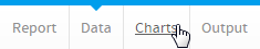
Tutorial
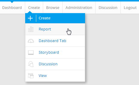
1. Click the Create link in the main navigation bar of the system, and select the Report option.
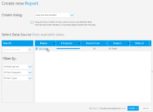
2. You will now be on the Report Initialisation page. Ensure the Drag and Drop Builder has been selected to use for report creation.
3. Click on the Ski Team view in order to use the fields defined within it for creating the report.
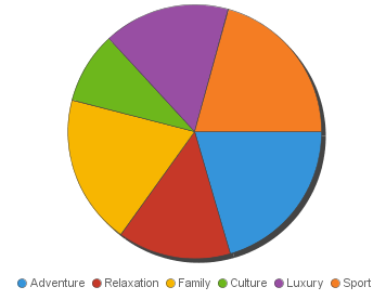
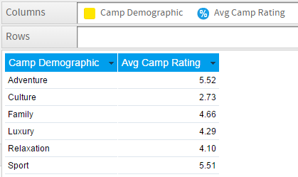
4. Add Camp Demographic and Camp Rating to Columns.
5. Proceed to the Charts step of the builder.
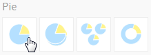
6. Select the Pie chart from the Pie section of the charts panel on the right of the screen.
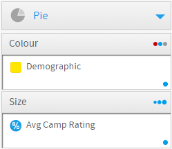
7. Set the following components:
- Colour: Camp Demographic
- Size: Avg Camp Rating
8. Save your report