Launching pre-built content through the Google Analytics connector will provide you access to an impressive range of analytical data based on your websites and applications. You will then be able to track and assess the performance of your site and its traffic, directly through your Yellowfin dashboard. Discover where your visitors are coming from, which pages were visited the most, and how they found you.
In this section, you will get familiar with the different types of data that Yellowfin offers through the Google Analytics data source connection. But first, you will need to download and install the connector from Yellowfin's Marketplace. Click here to learn more about this.
Once you're set up, access your Google Analytics dashboard to start uncovering better and faster insights to share and collaborate with users. It should be noted, however, that the content type provided here is retrieved from the Google API and therefore, is subject to change by Google.
Overview
The very first tab provides information on website acquisition and how it relates to various situations. Note that the content displayed in any of the charts and tables will be filtered according to the time range set through the filter.
| Name | Description | Example of Chart |
|---|---|---|
| Acquisition overview | This panel displays some basic website statistics, described in more detail below. |  |
| Sessions | See exactly how many times your website has been visited, within the selected time range. |  |
| Users | Track how many visitors your website receives. |  |
| Average Session Duration | You can even see the average amount of time users spend on your website. |  |
| Pages per Session | Check the average number of pages that get viewed during a session. |  |
| Bounce Rate | Bounce rate is defined as the percentage of single-page sessions, that is, the number of visits in which a person exits your site after visiting just the landing page. |  |
| Acquisition and engagement by channel | These bar charts let you view how your website is performing across various channels. They display the standard website statistics, explained above, as recorded for all the different channels. Place your cursor over a bar for direct insight into it. For example, you can view the average session duration on social media. |  |
| Acquisition and engagement by time | Use this chart to track the usage of your website over time. For example, you can determine the exact day your website received an increase in users, sessions and more.
|  |
| Sessions by day and hour – heat grid | Track your website's usage through this unique heat grid. Displayed here are the number of sessions according to every hour on each day. The colour of an hour gets darker, as there is an increase in its sessions. You can also hover your cursor over a block to view further details related to that specific hour. |  |
| Top 100 page views | This table displays website pages with the most views. Use this to easily track the most popular pages in your website. |  |
New v Returning
This screen will compare the new visitors of your website to its returning users.
| Name | Description | Example of Chart |
|---|---|---|
| New versus returning percent | Pie charts displaying quick user stats. Each of these are defined below. |  |
| User count | This pie chart displays the percentage of new visitors your site is getting, compared to its returning visitors. |  |
| Session count | Refer to this chart for insightful information on sessions between new and returning users. |  |
| New versus returning detail | This table compares specific details of your site's new and returning users, such as the number of sessions, average duration of these sessions, page views, bounce rates, and more. |  |
| New versus returning over time | Yellowfin makes it easy to track and compare specific details of new and returning website users with the help of these graphs. |  |
Location
Scope the different locations your website is being accessed from.
| Name | Description | Example of Chart |
|---|---|---|
| Sessions by country | Directly detect which countries perform the most sessions in this colour coded world map. The colour of a country gets darker as the number of views in that area increases. Furthermore, you can view specific details on a country, by placing your cursor over it. Note: Countries that do not access your website at all, will be greyed-out. |
|
| Location by time | This provides a look into some of the acquisition statistics across the different continents, at varying days. |  |
| Language detail | This table provides a detailed look at the different languages your website gets translated into. Use it to view the number of users, sum of sessions, average duration of sessions, pages viewed per session, bounce rates, and page views for specific languages. |  |

Audience
This page provides you a complete insight into your website users. Using this information, you can learn more about them and target your audience.
| Name | Description | Example of Chart |
|---|---|---|
| Top 10 in-market segments | These bar charts display the standard acquisition content according to the top 10 in-market segments. This will let you know which market areas your users are coming from, their session amounts and average durations, pages accessed per session, as well as the bounce rate of each market segment. |
|
| Sessions by gender and age | Utilize this pie chart for a quick look into the number of sessions regarding each gender type. Additionally, you can use the bar chart to track the sum of sessions according to different age ranges. Place your cursor over a bar or slice to view its specific details. |  |
| Acquisition and engagement by gender and age | These gender specific charts shed light on the standard website data, as pertaining to various age groups. |  |
| Top 10 affinity category | Provides statistics on the top 10 affinity categories in the form of bar charts. This will help you learn more about your audience and their preferences. For example, you can see the average session duration avid investors spend on your site. |  |

Technology
Learn more about the technology that is used to access or view your website.
| Name | Description | Example of Chart |
|---|---|---|
| Platform breakdowns | These pie charts break down data on the usage of operating systems and browsers, letting you compare each of these against their types. Furthermore, you can click on the 'other' option for a drill down into more types of operating systems and browsers. |
|
| Device category acquisition and engagement | Charts that focus on data gathered through the usage of standard website-viewing devices. This is an easy way to determine which devices bring in the most traffic. Place your cursor over a bar for specific details. For example, you can view the average session duration mobile users spend on your website. | 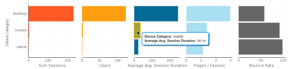 |
| Device category by time | Track the increase and decrease in sessions according to each type of device, on varying days. |  |
| Average page load time | Use this graph to track the time your website takes to load during different days. The large spikes will let you know when your site was slow to load. |  |

Channel
Get up-to-date on the channels being used to gain access to your website.
| Name | Description | Example of Chart |
|---|---|---|
| Acquisition by channel and time | Through this chart you can track increases and decreases in the session rates across different channels on various days. |
|
| Channel traffic sources | The exact source of a channel that brought in traffic to your website. Each channel is separately covered with the use of individual tabs. |  |
| Acquisition by social source | A further look into the various social media channels. This sheds light on the standard website data according to these social channels. |  |
| Acquisition for all social sources by time | With this chart, you get a graphical representation of the standard website data for social sources across various time intervals. |  |

AdWords
You can get a breakdown of your ads on Google, with the help of Google's AdWords service.
Note: This information only appears for users who are using AdWords for their website.
| Name | Description | Example of Chart |
|---|---|---|
| AdWords metrics | This panel displays basic information regarding Google AdWords. These are described below. |
|
| Impressions | Impression refers to the exact number of times your ad was shown. | |
| Clicks | This statistic lets you discover how many times your ad was clicked on. | |
| Click Through Rate (CTR) | Click-through rate is defined as the rate with which your ad gets clicked on. This will let you know if your ad is attracting enough users, and how closely it matches your target settings. | |
| Cost | The cost of using the Google AdWords service for the specified time period. | |
| AdWords metrics over time | Use this panel to track the standard ad information, explained above, over different time intervals. | |
| AdWords click treemap | This unique tree map displays information on your ads according to their campaigns, but with an interesting feature: the size of an ad block expands with the increase in clicks, whereas the colour gets darker with the increase in impressions. Hover your cursor over a block for quick stats on a particular ad. | |
| AdWords campaign detail | View the details of your ad campaign in a single table. Using this you can get instant information on your ads, such as the number of clicks, CPC, bounce rate, cost, goal completions, cost per goal conversion, and the calculated goal conversion rate. |
Goals
The statistics displayed here relate to your website goals and their progress.
Note: Data will only appear on this page if you have website goals defined.
| Name | Description | Example of Chart |
|---|---|---|
| Goals by channel | View the progress of all your goals across different channels. |
|
| Goals complete over time | Track the completion of your goals over different intervals in time through this chart. | |
| Goals by campaign (Top 10) | These charts display goal completions, goal conversion rates and bounce rates of the top 10 goals according to the ad campaigns. |