Launching pre-built content through the Google Analytics connector will provide you access to an impressive range of analytical data based on your websites and applications. You will then be able to track and assess the performance of your site and its traffic, directly through your Yellowfin dashboard. Discover where your visitors are coming from, which pages were visited the most, and how they found you.
In this section, you will get familiar with the different types of data that Yellowfin offers through the Google Analytics data source connection. But first, you will need to download and install the connector from Yellowfin's Marketplace. Click here to learn more about this.
Once you're set up, access your Google Analytics dashboard to start uncovering better and faster insights to share and collaborate with users. It should be noted, however, that the content type provided here is retrieved from the Google API and therefore, is subject to change by Google.
The Overview tab
The very first tab provides information on website acquisition and how it relates to various situations. Note that the content displayed in any of the charts and tables will be filtered according to the time range set through the filter.
| Name | Description | Example of Chart |
|---|---|---|
| Google - Acquisition Overview | This chart displays most important metrics for your website which include total number of sessions, number of users that interacted with your website, average time per user spent on your website in hh:mm:ss, average number of pages visited by your audience per session and percentage of bounce rate (percentage of single page sessions that a user decides to leave your website without further interacting with the landed page, higher bounce rate or increasing bounce rate in most instances is bad for the your website). |  |
| Google - Acquisition and engagement by Channel | The chart aims to provide key measures such as sessions, users and bounce rate, etc. for your website across various traffic sources based on default channel grouping. Place your cursor over a bar for direct insight into it. For example, you can view the average session duration on social media. |  |
| Google - Acquisition and engagement by Time | This chart provides the trend of key measures, such as sessions, average session time, bounce rate and more, over time. |  |
| Google - Sessions by day and hour heat grid | This heat grid chart displays the day of week and hour of day your website users are engaging with your website, where darker color signifies higher active sessions and lighter color signifies fewer active sessions. |  |
| Top 100 page views | This table displays website pages with the most views. Use this to easily track the most popular pages in your website. |  |
The New v Return tab
This screen will compare the new visitors of your website to its returning users.
| Name | Description | Example of Chart |
|---|---|---|
| Google - New versus Returning Percent | These ring charts compare the ratio of new visitors and returning visitors of your website across all users, and compares these user types based on their interaction with your website. The User Count ring chart displays the percentage of new visitors your site is getting, compared to its returning visitors. The Session count ring chart displays the percentage of sessions from new visitors vs returning visitors. |  |
| Google - New v Returning Detail | This report displays top stats of new visitors and returning visitors of your website, such as total users, number of sessions, total page views, average session duration, average page visits per session and bounce rate percentage. |  |
| Google - New v Returning over time | The chart compares new visitors and returning visitors on key metrics and helps analyzing your website performance for both user types over time. |  |
The Location tab
Scope the different locations your website is being accessed from.
| Name | Description | Example of Chart |
|---|---|---|
| Sessions by country | This heat map displays countries with active sessions for your website. A darker color signifies higher active sessions by country compared with countries with a lighter color. You can view specific details on a country by placing your cursor over it. Countries that do not access your website at all are greyed-out. |
|
| Google - Location by time | This chart compares various regions and provides insights into how all regions are performing over time, based on number of user sessions, total number of user visits and new user visits for your website. |  |
| Google - Language detail | This report lists languages in descending order of number of user sessions by language. Other important metrics across user language are also provided. it to view the number of users, sum of sessions, average duration of sessions, pages viewed per session, bounce rates, and page views for specific languages. | 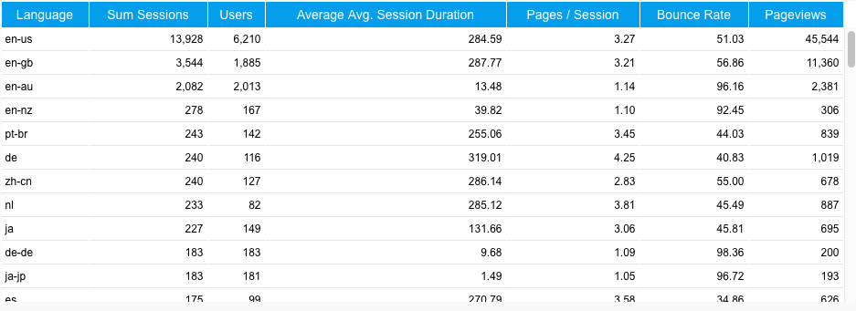 |

The Audience tab
This page provides you a complete insight into your website users. Using this information, you can learn more about them and target your audience.
| Name | Description | Example of Chart |
|---|---|---|
| Google - Top 10 in-Market Segment | This chart shows and compares top 10 user interest segments by number of sessions, and compares these segments across the number of users, average session duration, average page visits per session and bounce rate. This analysis can help you to customize your website to cater for these top segments. |
|
| Google - sessions by gender by age | These charts show a breakdown of male and female session percentages for your website, and provide a breakdown of number of sessions across different age groups. The charts help to analyze the gender type and age groups that have interest in your website content. Place your cursor over a bar or slice to view its specific details. |  |
| Google - acquisition and engagement by gender and age | This chart provides insight into male and female segments, as well as comparison of these segments across different age groups. The analysis compares number of sessions, number of users, average session time per user, average page interaction per session and bounce rate for each segment. |  |
| Google - Top 10 Affinity Category | This report shows the overall reach of your content and user interaction with your content based on their interests/affinity on web. The analysis will provide insight into users from top 10 interest groups that are engaging with your website content, this may assist you in setting advertisement targets, future content designs and creating or changing marketing strategies. |  |

The Technology tab
Learn more about the technology that is used to access or view your website.
| Name | Description | Example of Chart |
|---|---|---|
| Platform Breakdowns | These charts provide a breakdown of your audience based on the type of operating system they use and the type of browser they utilize to engage with your website. Based on the change in sessions for each platform and browser, you can get insight into user migration, as well as how user-friendly is your website content for handheld or desktop platforms and various browser types. This insight will assist you to manage your web design to support your wide variety of platform and browser users. You can click on the 'other' option for a drill down into more types of operating systems and browsers. |
|
| Google - Device Category Acquisition and Engagement | This chart compares device platform performance based on total number of sessions, number of users and other key metrics. The information will provide insight into the type of platform that is preferable to users when engaging with your website. This may further help you to manage your website content and design to meet various platform requirements. |  |
| Google - Device Category by time | This report provides the trend of daily sessions by different platform user types, which can help to analyze platform trends to plan future content and design specifications for your website. | 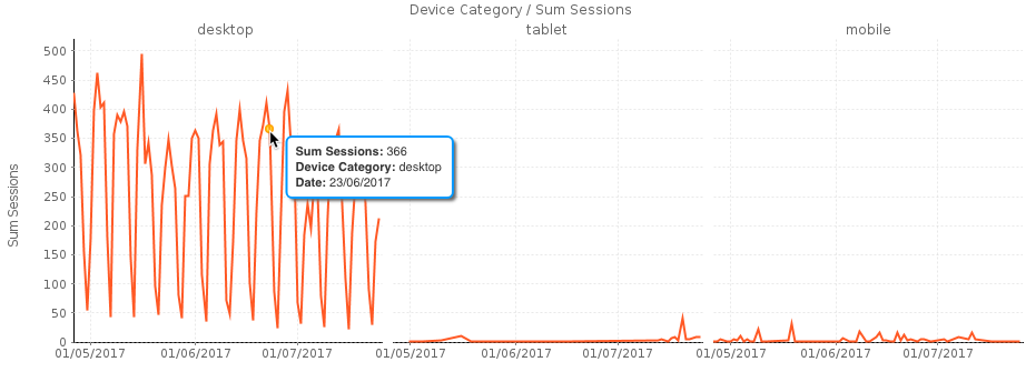 |
| Google - Ave Page Load Time | This report provides a trend of average load time in seconds for your website pages. Any abnormal peaks can be evaluated, and future high peaks can be prevented. |  |

The Channel tab
Get up-to-date on the channels being used to gain access to your website.
| Name | Description | Example of Chart |
|---|---|---|
| Google - Acquisition by Channel by Time | This report provides insights into how various traffic sources are performing in terms of number of user sessions. Change in session numbers may help to evaluate and manage your website’s current and future strategies |
|
| Channel - Traffic Sources | This report provides a detailed look into types of channels, and lists sources belonging to different channel types in a descending order of number of sessions. The report also provides insights into the percentage of new sessions generated by each source, which may help you to analyze value of a particular source in terms of generating total sessions as well as new sessions. |  |
| Google - Acquisition by Social Source | This report provides insight about performance of social network sources such as LinkedIn, Twitter, YouTube, Facebook, etc in terms of number of sessions, number of user visits, average time spent by a user on your website when they came through a social network source and average user’s bounce rate when they interacted with your content through social media. These insights will assist you to manage your social media sources better to engage users on your website. |  |
| Google - Acquisition for all Social Sources by time | This report provides insight into how your social sources together are performing in terms of key metrics over time. Trend analysis of your key metrics will assist you to conduct future planning and creating strategy around social network channels. |  |

The AdWords tab
This tab will only generate data if you have an AdWords account associated with Google Analytics, and your AdWords account is linked to the website being analyzed.
If you do not have an AdWords account, you can remove these reports from the dashboard manually.
| Name | Description | Example of Chart |
|---|---|---|
| Google - AdWord Metrics | This report provides key metrics for your AdWords account such as total number of clicks, total impressions created, the click through rate and total cost spending. | |
| Google - AdWord Metrics over time | This report gives a daily trend about number of impressions created, number of clicks made by people who viewed the ad, percentage of people who clicked on the ad in relation to total number of people who saw the ad (CTR – Click Through Rate), average cost for every click, daily cost for goal conversion and daily cost. These metrics will assist set future budget and measure your strategy for your ad campaigns. | |
| Google - AdWord Click Treemap | This chart provides hierarchical view of performance of your various ad campaigns and performance of different ad groups associated with the campaign, in terms of number of clicks and impressions. The insights gained will help optimize future spending across various campaigns to get the most value out of these ad campaigns. | |
| AdWords Campaigns Detail | This report provides detail of each campaign associated with your AdWords account. |
The Goals tab
The statistics displayed here relate to your website goals and their progress.
Note: Data will only appear on this page if you have website goals defined.
| Name | Description | Example of Chart |
|---|---|---|
| Google - Goals by Channel | This report provides insights into various traffic sources and performance of these channels in terms of overall goal completions, goal conversion rates which means percentage of total goals completed in relation to total sessions and bounce rates. | |
| Google - Goals Complete over time | This report provides a trend of your goal completions and goal conversion rates. The report provides insights into the effectiveness of your website and ads, and may assist in setting future content, campaigns and goals. | |
| Google - Goals by Campaign (Top 10) | This report gives clear insights into performance of campaigns in terms of goal completion, goal conversion rates and bounce rates. The analysis will assist to manage campaigns more effectively to achieve more goals and maximize goal conversion rates. |