Yellowfin has a number of Parameter implementations which can be used out of the box. They are defined in the enum InputType. Below is a list of all the the available types, and their options, along with code samples.
| Type | Description | View Options | Code Sample |
|---|---|---|---|
| TEXTBOX | A text input box. |
| ParameterImpl parameter = new ParameterImpl();
parameter.setProperty("DECIMALS");
parameter.setInputType(InputType.TEXTBOX);
parameter.setName("Decimal Places");
parameter.setMinAllowed(0);
parameter.addViewOption("numericOnly", true);
parameter.addViewOption("numericType", "INTEGER");
|
| SELECT | A drop down list. The value and description are taken from the Possible Values added to this parameter. |
| ParameterImpl p = new ParameterImpl();
p.setProperty("DATE_FORMAT");
p.setName("Format");
p.setInputType(InputType.SELECT);
List<CustomValue<?>> optValues = new ArrayList<>();
optValues.add(new CustomValue(""," - - Select - - ");
optValues.add(new CustomValue("YEAR","Year"));
optValues.add(new CustomValue("YEAR_START","Year Start Date"));
optValues.add(new CustomValue("YEAR_END","Year End Date"));
p.setPossibleValues(optValues);
|
| RADIO | A group of Radio Buttons. Has a radio button for each option. |
| ParameterImpl parameter = new ParameterImpl();
parameter.setProperty("STARTING_POINT");
parameter.setInputType(InputType.RADIO);
parameter.addPossibleValue("LEFT", "Left");
parameter.addPossibleValue("RIGHT", "Right");
parameter.addPossibleValue("MIDDLE", "Middle");
|
| DATE, TIMESTAMP | Date/Timestamp input element. These are mostly similar and have the same view options. The key set using setProperty stores the input value. Format:
Dynamic Dates: In case of Dynamic Dates, the unit is stored against the key specified in the view option “unitCodeProperty”. Dynamic date values are stored as “SYSDATE+x”. For example, if property=STARTDATE and unitCodeProperty=STARTUNIT Today - 1 Year is stored as: STARTDATE: SYSDATE-1 STARTUNIT: YEAR |
| ParameterImpl p = new ParameterImpl();
p.setProperty("STARTDATE");
p.addViewOption("useCurrentDate", "true");
p.addViewOption("unitCodeProperty", "STARTUNIT");
p.setInputType(InputType.DATE);
|
| TIME | Text input element which verifies time data input. Valid time input is saved against the specified property in hh:mm:ss format (24 hour). This widget does not have any styling options.  |
| ParameterImpl p = new ParameterImpl();
p.setProperty("RUN_TIME");
p.setInputType(InputType.TIME);
|
| CHECKBOX | Displays one or more standard Yellowfin checkboxes. |
| ParameterImpl p = new ParameterImpl();
p.setInputType(InputType.CHECKBOX);
p.setProperty("INCLUDED_FIELDS");
p.setParameterClassName("included-fields");
p.addViewOption("tooltip", true);
p.addPossibleValue("field001", "PERSONID");
p.addPossibleValue("field002", "CAMPID");
p.addPossibleValue("field003", "INVOICEDAMOUNT");
|
| BUTTON | Renders a standard Yellowfin button. |
data:<MIME Type>;base64, <base64 String>
| ParameterImpl p = new ParameterImpl();
p.setProperty("apply");
p.setInputType(InputType.BUTTON);
p.addViewOption("text", "Apply");
p.addViewOption("flat", true);
p.addViewOption("style", "blue");
p.addViewOption("width", "50px");
p.addViewOption("height", "40px");
|
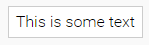
| STATIC | Renders a block of static text. |
| ParameterImpl p = new ParameterImpl();
p.addViewOption("text", "This is some text");
p.setInputType(InputType.STATIC);
|
| COLOURPICKER | Standard Yellowfin colour-picker. | None. | ParameterImpl p = new ParameterImpl(); p.setInputType( InputType.COLOURPICKER); |
| SLIDERANDTEXT | Slider input with a linked text box which allows input via either method.  |
| ParameterImpl p = new ParameterImpl();
p.setName("Group Size");
p.setProperty("size");
p.setInputType(InputType.SLIDERANDTEXT);
p.addViewOption("textMaxValue", "20");
p.addViewOption("maxValue", "20");
p.setDefaultValue(5);
|
| TOGGLE | Renders an On/Off toggle slider. |
| ParameterImpl p = new ParameterImpl();
p.setProperty("FIRST_ROW_HEADER");
p.setName("First row contains unique titles");
p.setDefaultValue(true);
p.setInputType(InputType.TOGGLE);
|
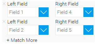
| FIELDMATCHDROPDOWN | Accepts two lists of FieldObject (see the section on Helper Objects) which can be matched to one another. There may be one or more matches. The resulting relationships are returned in an array of objects which look like:
{
  'from': fieldA.id,
  'to': fieldB.id
}
|
| ParameterImpl p = new ParameterImpl();
p.setProperty("fieldMatchProperty");
p.setList(true); //List of matches
ListOptions lo = new ListOptions();
lo.setAddButtonText("Match More");
p.setListOptions(lo);
FieldObjectDataType textType = FieldObjectDataType.TEXT;
FieldObjectDataType numericType = FieldObjectDataType.NUMERIC;
// LIST A
List<FieldObject> fieldListA = new LinkedList<>();
FieldObject field1 = new FieldObject("1", "", "Field 1", textType);
FieldObject field2 = new FieldObject("2", "", "Field 2", numericType);
fieldListA.add(field1);
fieldListA.add(field2);
// LIST B
List<FieldObject> fieldListB = new LinkedList<>();
FieldObject field3 = new FieldObject("3", "", "Field 3", textType);
FieldObject field4 = new FieldObject("4", "", "Field 4", numericType);
FieldObject field5 = new FieldObject("5", "", "Field 5", textType);
FieldObject field6 = new FieldObject("6", "", "Field 6", numericType);
fieldListB.add(field3);
fieldListB.add(field4);
fieldListB.add(field5);
fieldListB.add(field6);
// Add the lists to the Match widget
p.addViewOption("fieldListA", fieldListA);
p.addViewOption("fieldListB", fieldListB);
p.addViewOption("titleA", "Left Field");
p.addViewOption("titleB", "Right Field");
p.setInputType(InputType.FIELDMATCHDROPDOWN);
|
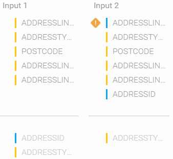
| FIELDMATCH | This serves the same function as FIELDMATCHDROPDOWN. Fields are matched by dragging them around. They are matched by data type, which are colour coded. Fields which cannot be matched are flagged. Fields from one side may also be excluded by dragging them to the “exclude” zone. The resulting relationships are returned in a similar format as FIELDMATCHDROPDOWN. When a field is excluded from one column, the match object for that row will not have the corresponding “from” or “to” attribute. For example, the object for ADDRESSID in the below screenshot would be {
'to': ADDRESSID.id
}
|
| ParameterImpl p = new ParameterImpl();
p.setInputType(InputType.FIELDMATCH);
p.setProperty("UNION_FIELD_MATCH");
p.addViewOption("includeUnmatched", true);
//Match exact types
p.addViewOption("roughMatch", false);
List<FieldObject> foListA = new ArrayList<>();
List<FieldObject> foListB = new ArrayList<>();
FieldObjectDataType textDataType = FieldObjectDataType.TEXT;
FieldObjectDataType numericDataType = FieldObjectDataType.NUMERIC;
// LIST A
FieldObject field1 = new FieldObject("1", "primary", "Field 1", textDataType); //Primary Key
FieldObject field2 = new FieldObject("2", "", "Field 2", numericDataType);//This is a metric
foListA.add(field1);
foListA.add(field2);
// LIST A
FieldObject field3 = new FieldObject("3", "", "Field 3", textDataType);
FieldObject field4 = new FieldObject("4", "", "Field 4", numericDataType);//This is a metric
FieldObject field5 = new FieldObject("5", "", "Field 5", textDataType);
FieldObject field6 = new FieldObject("6", "", "Field 6", numericDataType);//This is a metric
foListB.add(field3);
foListB.add(field4);
foListB.add(field5);
foListB.add(field6);
p.addViewOption("fieldListA", foListA);
p.addViewOption("fieldListB", foListB);
//Input 1
p.addViewOption("titleA", "Input 1");
//Input 2
p.addViewOption("titleB", "Input 2");
The above code will generate the following: |
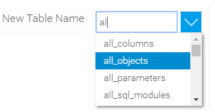
| AUTOCOMPLETETEXTBOX | This renders a searchable dropdown list. Searchable items should be CustomValue objects added as “possibleValues” of the Parameter. |
| ParameterImpl p = new ParameterImpl();
p.setProperty("TABLETEXTBOX");
p.setName("New Table Name");
p.setInputType(InputType.AUTOCOMPLETETEXTBOX);
p.addViewOption("width", 200);
CustomValue<String> initialValue = new CustomValue<String>("all_objects", "all_objects");
p.addViewOption("initialValue", initialValue);
List<CustomValue<?>> possibleValues = new ArrayList<>();
possibleValues.add(new CustomValue<String>("all_columns", "all_columns"));
possibleValues.add(new CustomValue<String>("all_parameters", "all_parameters"));
possibleValues.add(new CustomValue<String>("all_sql_modules", "all_sql_modules"));
possibleValues.add(new CustomValue<String>("all_tables", "all_tables"));
p.setPossibleValues(possibleValues);
p.addViewOption("width", 200);
p.addViewOption("resultListStyle", "outputStepAutoCompleteList");
|
| SHOWADVANCED | An accordion-like widget to show/hide other UI elements. This should be used with ParameterDisplayRules.  |
| Boolean value = true;
Boolean negative = false;
// SHOW_ADVANCED_SETTINGS == true
ParameterDisplayRule advancedSettingsDisplayRule = new ParameterDisplayRule("AND", "SHOW_ADVANCED_SETTINGS", value, negative);
ParameterImpl p = new ParameterImpl();
p.setProperty("ALL_ROWS");
p.setName("All Rows");
p.setDefaultValue(true);
p.setInputType(InputType.TOGGLE);
p.addDisplayRule(advancedSettingsDisplayRule);
paramList.add(p);
p = new ParameterImpl();
p.setProperty("SEPARATOR");
p.setName("Separator");
p.setInputType(InputType.TEXTBOX);
p.addViewOption("width", "40px");
p.addDisplayRule(advancedSettingsDisplayRule);
paramList.add(p);
p = new ParameterImpl();
p.setProperty("SHOW_ADVANCED_SETTINGS");
p.setInputType(InputType.SHOWADVANCED);
p.setDefaultValue(false);
p.addViewOption("showText", "Advanced Settings ↓");
p.addViewOption("hideText", "Less ↑");
p.addViewOption("width", "150px");
paramList.add(p);
|
| PAIRCOLUMNS | Renders paired data in two columns. There is a control for deleting rows. Whenever the Parameter data changes, the columns are re-rendered to show the new data. The data should be an array having objects of the format: {
column1Key: dataRow1Col1
column2Key: dataRow2Col2
}
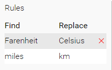 |
| ParameterImpl p = new ParameterImpl();
p.setProperty("RULES_PARAM");
p.setName("Rules");
p.setInputType(InputType.PAIRCOLUMNS);
p.addViewOption("column1Header", "Find");
p.addViewOption("column2Header", "Replace");
p.addViewOption("column1Key", "FIND_PARAMETER");
p.addViewOption("column2Key", "REPLACE_PARAMETER");
List<Map<String, String>> defaults = new ArrayList<>();
Map<String, String> row = new HashMap<>();
row.put("FIND_PARAMETER", "Farenheit");
row.put("REPLACE_PARAMETER", "Celsius");
defaults.add(row);
row = new HashMap<>();
row.put("FIND_PARAMETER", "miles");
row.put("REPLACE_PARAMETER", "km");
defaults.add(row);
p.setDefaultValue(defaults);
|
| DELIMITEREXAMPLE | Shows example output on applying a delimiter to split a row of data. |
| ParameterImpl p = new ParameterImpl();
p.setProperty("DELIMITER");
p.addViewOption("text", "7 Rosella Avenue;Boronia;3155;Victoria");
p.setInputType(InputType.DELIMITEREXAMPLE);
|
| INPUTLIST |
| Map<String, String> viewOptions1 = new HashMap<>();
viewOptions1.put("property", "FIND");
Map<String, String> viewOptions2 = new HashMap<>();
viewOptions2.put("property", "REPLACE");
Map<String, Map<String, String>> inputOption1 = new HashMap<>();
inputOption1.put("controlType", "TEXTBOX");
inputOption1.put("viewOptions", viewOptions1);
Map<String, Map<String, String>> inputOption2 = new HashMap<>();
inputOption2.put("controlType", "TEXTBOX");
inputOption2.put("viewOptions", viewOptions2);
List<Map<String, Map<String, String>> inputOptions = new ArrayList<>();
ParameterImpl p = new ParameterImpl();
p.setInputType(InputType.INPUTLIST);
p.setProperty("FIND_AND_REPLACE_INPUTS");
p.addViewOption("inputOptions", inputOptions);
|


Special Implementations
Besides the commonly defined parameters, there are also a few special implementations. These are listed below:
| Implementation | Description | Methods | View Options | Code Sample |
|---|---|---|---|---|
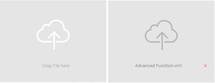
| FileUploadParameter | This is used to generate UI for uploading a file. It also has a way to delete an uploaded file. |
|
| FileUploadParameter p = new FileUploadParameter("UPLOAD_FILE_KEY", "*", "FILE", null);
p.setParameterClassName("left-param");
p.setUploadImageBase64(getBase64OffImage(), "image/svg+xml");
p.setUploadImageHoverBase64(getBase64OnImage(), "image/svg+xml");
p.setUploadWidgetText("Drag File Here");
The uploaded file can be accessed from a data transformation step using: byte[] rawData = this.getFile("UPLOAD_FILE_KEY");
|
| PasswordParameter | This is used to generate UI for a password field. Things typed in the field are masked and they can be encrypted/decrypted by the framework. When used in Data Transformations, Yellowfin automatically encrypts the value when the current value is different from what was previously saved as a Step Option. The component using the parameter is expected to decrypt the password before using it. |
|
| Defining a password parameter: PasswordParameter apiKey = new PasswordParameter("API_KEY", "myApiKey");
apiKey.setName("API Key");
apiKey.addViewOption("width", "190px");
Using a password parameter: List<Parameter> paramsList = getPanelCollection().getSectionMap().get("passwordSection").getParameters();
for (Parameter parameter : paramsList){
if ("API_KEY".equals(parameter.getProperty())){
PasswordParameter pwd = ((PasswordParameter) parameter;
pwd.setValue(getStepOption("API_KEY"));
try {
apiKey = pwd.decrypt();
} catch (Exception e) {
throwUnhandledETLException(e);
}
}
}
|