Overview
The GIS Heat Map is an advanced form of GIS Bubble Chart, which uses GIS Points to specify bubble positions, and a metric to specify the heat color of the area.
Chart data options
Option | Description |
|---|---|
Geo Field | The field containing the GIS Point data. |
Color | A metric field that represents the heat color of the area. |
Instructions
This tutorial demonstrates how to use a GIS heat map with your dataset.
- Click on the Create button and select Report to begin building your report.

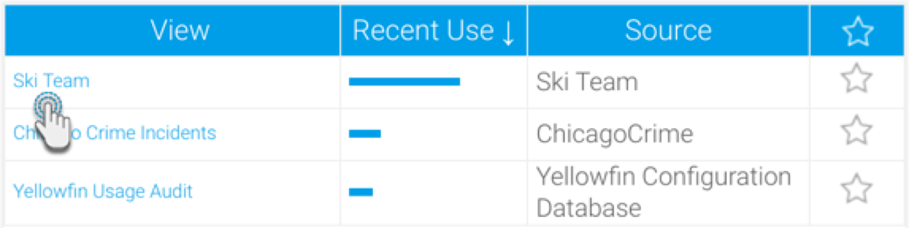
- Select your preferred View containing the GIS data. For the purpose of this example, we will choose Ski Team.
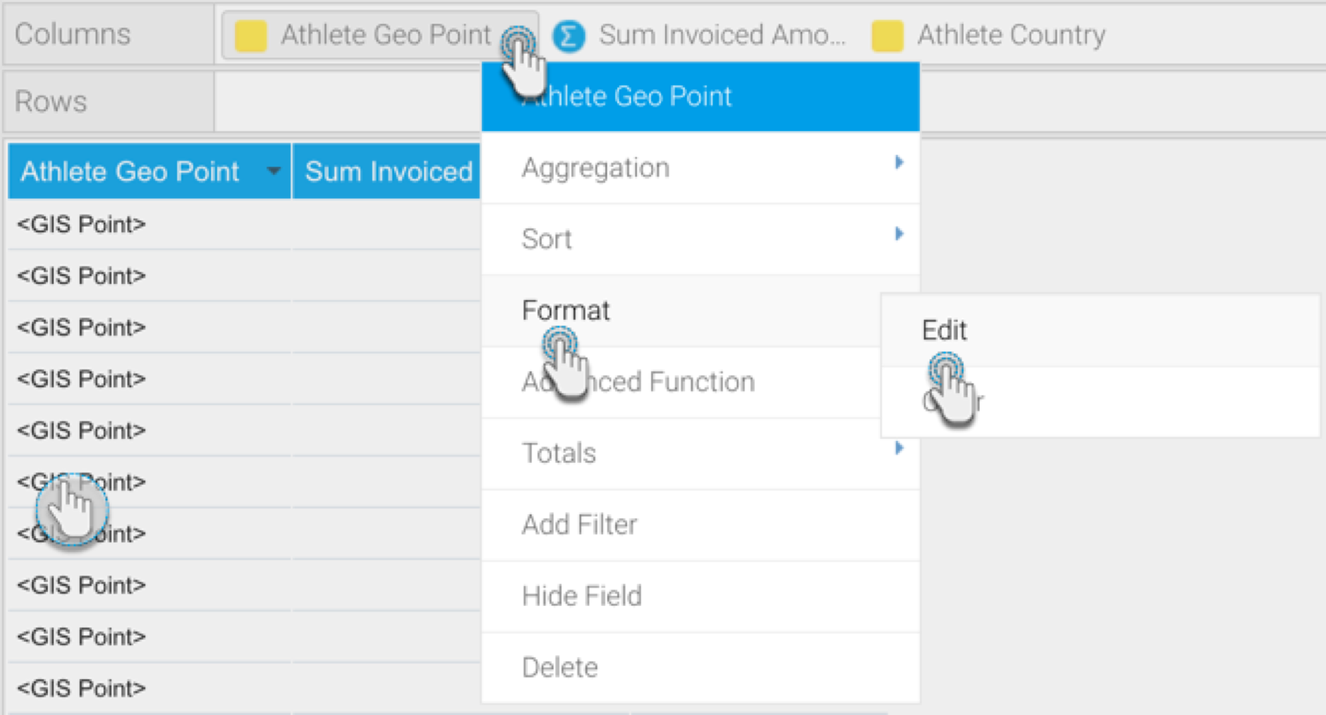
- When at the Report Builder page, add your required data, including the GIS and metric data fields to the report. For example, we will use the Athlete Geo Point, and Sum Invoiced Amount fields in our report.
Click below to see an optional formatting tip to display geopoint or geo polygon data is its original form.
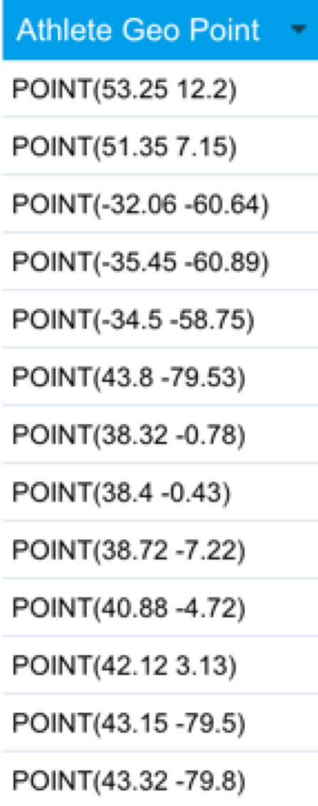
By default, the report builder formats geopoint or geo polygon data to ‘Default Geometry’ (so it’s displayed like in the example below). However you can view geo points or polygons in their original form by changing the formatting.
- To do so, click on Format in the geopoint column menu, then select Edit.
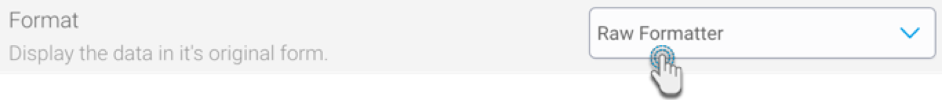
- Then select ‘Raw Formatter’ from the Format field in the popup.
- Close the popup. The geopoint data will be visible in its original form in the report.
- Warning: Note that applying raw formatting on a large geopoint or geo polygon data set, may slow your report’s processing time.
- To do so, click on Format in the geopoint column menu, then select Edit.
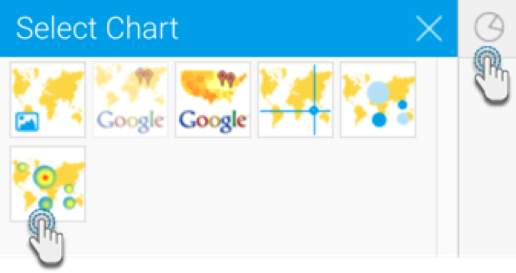
- Navigate to the Charts page, and expand the chart selection menu. Choose GIS Heat Maps from this selection.
- Next, fill the required fields for your GIS chart, for example drag Athlete Geo Point to the Geo Field component, and your selected metric to the Color component. You can refer to the above Chart Data Options section for a description of all the components.
- You will be able to see your GIS heat map chart. The heat color range based on the value of the metric field. (You can change the color range in the Series settings).
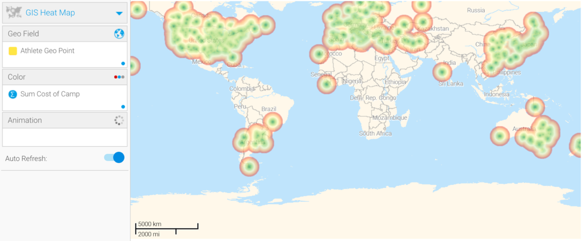
- The above example shows the default background image (World image) of the GIS map that provides context to the location.
- You can hide this image by configuring the map settings. There’s two ways to do so:
- Click Chart Settings, expand Style, and disable the GIS Base Layer toggle.
- Go to Administration > Content Setting > Maps Settings and disable the GIS Base Layer toggle.
- You can also use the chart formatting settings to further configure your Google chart. Refer to our chart formatting section for more information.
- Or you could add a layer to your map chart. Learn more about this here.
- Once done, save your map.