Page History
...
Note:If you are not already on the Browse page, please navigate there. (Burger Bun ![]() -> Browse All)
-> Browse All)
Create a Multiple Table View:
- Click Create
 and select “View”.
...

Note: If you don’t see the Create button in the top right corner, open the Burger Bun. You’ll see a yellow Create option. Open and select “View”.Alt text: User clicks on the yellow Create banner on the left and selects “View”.

- Select “Ski Team” as your Data Source.
...
Additional Learning: You also have the option to create a View from a single table from your database. If the Single Table option is selected, you will be prompted to select the desired table, and Yellowfin will skip the View Builder and take you straight to a draft Report. Additionally, advanced users have the option of using Freehand SQL.
Alt text: User selects the data source and View Type.
Creating the Model:
...
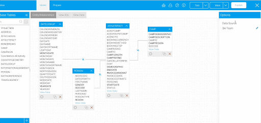
This table has information about athletes who have participated in ski camps.
Alt text: User drags in the “ATHLETEFACT” table onto the canvas.

- Select the gear
 Select the gear at the bottom of the table. In the Table Options on the right hand side, expand the Columns section.
...

- Select “CAMPRATING”, “DEMOGRAPHIC”, “ENDDATE”, “INVOICEDAMOUNT”, and “STARTDATE” from the list in the Columns tab. Click the gear at the bottom of the table again to update the settings. The columns you selected will now appear in bold.
Note: The selected fields will be visible as your columns when creating Reports. The unselected fields will not appear or be available to build content.
Alt text: User selects the columns from the “ATHLETEFACT” table.
Add “CAMP” Table:
...
You’ll use this table to extract information on the regions and demographics of the ski camps.
- Select the gear
 on the “CAMP” table.
 - Select “CAMPDEMOGRAPHIC”, “CAMPDESCRIPTION”, and “CAMPREGION” as your columns. Click the gear again to update the settings.
...

Next, join the two tables together.
Join the “ATHLETEFACT” table with the “CAMP” table:
- On the “ATHLETEFACT” table, click the join
 icon. This will pop up a window to set up your join.
...
- From the “ATHLETEFACT” table, select the “CAMPID” column to be used to join the tables together. Set the operator to “Equal to” and from the “CAMP” table, select the “CAMPID” column. Click Add, then click Save & Close at the top right corner.
Alt text: User configures the join between the “ATHLETEFACT” and “CAMP” tables.

You should You should now see your model, with the two tables joined together using an inner join.
...
Repeat this process for the “DATELOOKUP” table.
Add “DATELOOKUP” table:
- Drag in the “DATELOOKUP” table.
This table has one row per date. In the next steps, you will extract a few date fields of different granularities. These will be especially useful in building Time Series Charts later on.
- Select the table’s gear icon.
- Select “MONTHDATE” AND “YEARDATE” as the columns. Click the gear on the “DATELOOKUP” table again to save the changes.
...

Join “ATHLETEFACT” table with “DATELOOKUP” table:
- Select the join icon on the “ATHLETEFACT” table.
- Select “Inner Join” as the Join Type, and “One to One” as the Cardinality. In the Join To drop down menu, select “DATELOOKUP”.
Note: Again, the Join From needs to be the “ATHLETEFACT” table. - From the “ATHLETEFACT” table, select the “INVOICEDDATE” column to join the tables together. Set the operator to “Equal to” and from the “DATELOOKUP” table, select the “DAYDATE” column. Click Add, then click Save & Close at the top right corner.
...

Note:You can move the tables around as needed to make the diagrams easier to read as you add and join more tables.
Add “PERSON” table:
- Drag in the “PERSON” table.
This table has information about the people who have participated in ski camps. Add this table to analyse information on participant gender and location. - Select the table’s gear .
- Select “GENDER”, “ISOCODE, and “REGION” as the columns. Click the gear on the “PERSON” table to save the changes.
...

Note: Both the “ISOCODE” and “REGION” indicate a person’s location, just at different granular levels. You will map the iso codes to a list of countries later on.
Join “ATHLETEFACT” table with “PERSON” table:
- Select the join icon on the “ATHLETEFACT” table.
- Select “Inner Join” as the Join Type, and “One to One” as the Cardinality. In the Join To drop down menu, select “PERSON”.
- From the “ATHLETEFACT” table, select the “PERSONID” column to join the tables together. Set the operator to “Equal to” and from the “PERSON” table, and select the “PERSONID” column. Click Add, then click Save & Close at the top right corner.
Alt text: User configures the join between the “ATHLETEFACT” and “PERSON” tables.
...

You’ve now completed the Model stage of the View construction. You’ve joined the selected database tables together and chosen which columns will be available for analysis.
Continue on to learn how to edit the format of columns, create hierarchies, and make further adjustments to prepare the View for use.
Preparing the View:
- Click on the Prepare section.
Your View will change to a tabular layout, showing you a preview of your data.
Note: The Auto Refresh option can be toggled off. This can be useful when making changes to multiple columns on databases with large data volumes.
Formatting Basic Fields:
In this section, you will edit the formatting of multiple columns to make the data more readable and contextually appropriate. For example, you will be making changes such as adding currency prefixes to monetary values, adjusting the number of decimal places, and defining the default aggregations of metrics.
...
- Open the “Metrics” folder on the left hand side.
- Right click on the “INVOICEDAMOUNT” column.
- Select “Edit Format” from the dropdown menu.
...

Note: You can also click on the arrow in the column header to get to the “Edit Format” page.
Currently, the field names are the same as the column names in the database. Rename and format them to make them more readable.
Note: Although this isn’t edited in this demonstration, you can also add a description to the fields in the Format section. These can be utilized for usability purposes, especially for self-service Reporting.
- Open the Details section and change the Display Name of “INVOICEDAMOUNT” to “Invoiced Amount”.
This title will appear as the column’s name when you are building or viewing Reports using this field.
Note: You can also double-click on the field to change the field name. - Move to the Format section and change the Decimal Places to “0”.
- Add a Prefix indicating currency. In this example, we use “$”.
...

Camp Rating:
Next, click on “CAMPRATING”.
- Open the Details tab and change the Display Name of “CAMPRATING” to “Camp Rating”.
The metric’s default aggregation is automatically set to “Sum”. In the case of camp ratings on a scale of 1 to 10, a sum aggregation would not make much sense. To better understand how users are rating the camps, analyze the average of the camp ratings. - Change the Default Aggregation to “Average”.
...

For the following five fields, you will just be changing the titles of the columns to title case for readability. There is no need to make any additional adjustments to these fields.
Camp Region:
- Change the Display Name of “CAMPREGION” to “Camp Region”.
...
- Change the Display Name of “CAMPDESCRIPTION” to “Camp Name”.
Note: See more information on field settings.
Reference Codes:
Reference Codes allow for more meaningful values in Reports with numeric- and text-based data by mapping a code to a descriptive value. For example, a text field that contains 'Y' or 'N' could be mapped to display 'Yes' or 'No'.
...
- Change the Display Name of “GENDER” to “Gender”.
- Change the Format to “Reference Code”.
- Select “Create New”.
- Name the Reference Code “Gender” and move to the Values tab.
- Click Populate from data source and change the descriptions to “Male” and “Female”. Click Save.
...

For the “Demographic” field, you will use an already existing Reference Code instead of creating your own.
...
- Change the Display Name of “DEMOGRAPHIC” to “Demographic”.
- Change the Format to “Reference Code”.
- Select “Demographic” as the Reference Type.
Note: This Reference Code has a custom sort order, custom colors, and custom images. When building a Report using the “Demographic” field, the data is sorted by this custom order. The custom colors and images can be utilized in Charts and filters to ensure values are easily identified and consistent across Reports.
...

Country:
- Change the Display Name of “ISOCODE” to “Country”.
- Change the Format to “Reference Code”.
- Select “Country” as the Reference Type.
...

Note: In addition to the View Builder, you can also create or edit Reference Codes in the Admin Console or the Report Builder.
...
Note: See additional information on Reference Codes.
Create a Drill Down Hierarchy:
...
When creating a Drill Down Hierarchy, you need to start from the top level and work your way down. In this example, you’ll create a drill from “Region” to “Country”, so you will start with the “Region” field at the top.
Note: You can create a Drill Down Hierarchy with more than two fields. In this case, if there was a “City” field, you could drill further from “Region” to “Country” to “City”.
Region to Country:
- Change the Display Name of “REGION” to “Region”.
- Close out of the Field Settings window.
- Right click on the “Region” field. Hover on Drill To in the dropdown menu. Select “Country”.
...

The two fields will now show that they're joined in a hierarchy with a gray line.
Note: See drill down examples and how to remove links within a hierarchy.
Note: You can create date hierarchies based on a single date field in your data source. They are ideal for use with time series charts, as they use granularity to dictate day/week/month/year. See more information on date hierarchies.
Change the Date Format:
For Date Field Types, you can specify the format to be applied. This will not alter the raw data, just change the way it is displayed.
...
- Change the Display Name of “MONTHDATE” to “Month, Year”.
- The Format should be set to “Date”.
- Select “Other” as the Date Format.
This way, you’ll be able to build your own custom date format. - Enter “MMM, yy” as the Custom Date Format.
Alt text: User edits the format of the “Month, Year” field.
...

Now the date “01/02/2023” will display as “Feb, 23”.
Year:
For the “Year” column, use the Date Part Formatter that allows us to display part of the date, e.g. Month Name, rather than the full date.
- Change the Display Name of “YEARDATE” to “Year”.
- Switch the Format to “Date Part Formatter”. Select “Year” as the format.
...

Note: See more information on date formatting.
Create Calculated Fields:
...
First, create an “Athlete Counter” to easily aggregate the number of athletes by camp or region. For example, when building a Report with the “Region” and “Athlete Counter” fields, the Report should show the number of athletes from each region.
- Select the
 icon under the list of fields.
 - Select “Calculated Field”.
- Enter “Athlete Counter” as the Calculated Field Name.
- Place it in the “Metrics” folder.
- Type “1” in the text box and select “+Add”.

- Select Save and close the window to save your calculated field.
The “Athlete Counter” field should now be visible in the “Metrics” field folder.
...

- Right click on the “Athlete Counter” column.
- Select “Edit Format” from the dropdown menu.
- Change the Decimal Places from “2” to “0”.
- Change the Default Aggregation to “Sum”.
...

- Close the Field Settings window.
...
To do this, create a Pre-Defined calculated field using Yellowfin’s built-in functions.
- Select the icon under the list of fields. Choose “Calculated Field” from the drop down menu.
- Enter “Camp Days” as the Calculated Field Name.
- Place it in the “Metrics” folder.
- Select the “Pre-Defined” Formula Type.
- Select the “Days Between, HSQL” Function.
- Change the Resulting Field Type to “Metric”.
- Select the fields “Start Date” and “End Date” for the “Start Date” and “End Date”.
- Select Save and close the window to save your calculated field.
Your field should now be displayed in the “Metrics” folder.
...

- Right click
Alt text: User creates another calculated field with the “Pre-Defined” Formula Type.
- Right click on the “Camp Days” column.
- Select “Edit Format” from the dropdown menu.
- Change the Decimal Places from “2” to “0”.
- Change the Default Aggregation to “Average”.
...

Note: See another example creating a calculated field.
Create a Filter Group:
There may be cases where multiple Reports will need the same set of filters, either pre-defined, or user-prompt. To save you adding and adjusting filters in each individual Report, you can create filter groups in the View.
- Select the icon under the list of fields. Choose “Filter Group” from the dropdown menu.
- Enter “Camp Filters” as the Filter Group Name and place it in the “Dimensions” folder. Click Submit.
- Drag “Camp Region” and “Camp Demographic” into the filter box. Close the window and your Filter Group should appear on the left hand side.
...

Note: See information on cached dependent filters.
Next, you will move all the fields into relevant folders.
Organize the View:
Assigning fields to relevant folders lets you organize your fields in a way that is logical for Report writers. You can group fields differently than how the columns were grouped in the table structure in the data source.
Fields selected in the Model phase will automatically be placed in generic “Metrics”, “Dimension”, and “Time” folders. In the following steps, you will place the fields in new folders.
Note: The field folders are purely for display purposes and contain no forms of security like the Content Folders.
- Select the icon under the list of fields. Choose “Add/Edit Folders” from the dropdown menu.
In the Field Folders popup, you can create new folders, delete existing folders and add fields to existing folders. - Select “Add Field Folder”.
The field will now appear in the list of field folders. - Type “Athlete Details”. Select “Add”.
- From the Select dropdown, click on “Camp”. Click Submit to save.
You’ll see the new folders on the left panel.
...

Now that the folders exist, we can add fields to them.- Drag “Invoiced Amount”, “Athlete Counter”, “Gender”, “Region”, “Country”, and “Demographic” to the “Athlete Details” folder.
Note: Use your usual keyboard/mouse combination to multi-select them.
...

- Drag “Camp Rating”, “Camp Days”, “Camp Name”, “Camp Demographic”, “Camp Region”, and “Camp Filters” to the “Camp” folder.
...
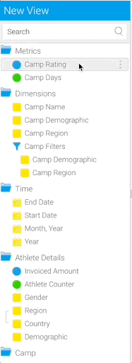
- Keep “Month, Year”, “Start Date”, “End Date”, and “Year” in the existing “Time” folder.
- Delete the “Metrics” and “Dimensions” folders using the red “x” on the right of the folder name.
- Using the burgericon on the left of the folder name, drag and drop “Time” to be after “Camp”.
...

Publish the View:
- Click Publish at the top right corner of the screen.
- Enter “Getting Started View” as the View Title.
- Place it in your “Getting Started with Yellowfin” folder and the “Content” sub-folder.
Note: To delete this version of your View, you can select the down arrow on the More tab on the top right menu. From there, select Delete Version.
...
Note: To edit the View, navigate to the Browse page and search for the view in the search bar. Right click on the View and select Edit. Then, select Model. Another page will pop up asking if you’d like to clone or edit the View. We recommend always selecting Clone. This will provide you with a safety net, so if you need to roll back to a previous version of the View, you have the option to do so. See more information on editing Views.
Note: To save the edited version of the View, click “Publish”. Remove the “(Clone)” from the name for best practice keeping your content clear and organized.
You are now ready to create Reports and Charts using your new View.
...