Page History
...
These allow users to create charts directly on the presentation without going through Yellowfin Data Discovery’s report builder. Quick Charts are created using Blueprint widgets, which include some of the most widely used chart types, and choosing the Simple Report creation option.
Note: For more advanced reporting, use Yellowfin’s Data Discovery.
...
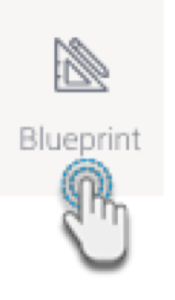
- Click on the Blueprint button on the left side to expand its panel.
- Drag a chart type of your choice onto the slide. You can position and resize it to fit your design.
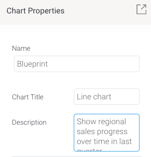
You can add a title and description for it in its properties panel (make sure the Blueprint Widget is selected on the slide to make its properties panel appear).
Tip Use the Activity Stream button (bottom right of the screen) to discuss and collaborate with other team members on your Blueprint further.
To create a Quick Chart (created directly in the presentation) or even an advanced chart (created in the report builder, but added here upon publish), proceed with the following steps.
Click on Create Report. You’ll be faced with two options:
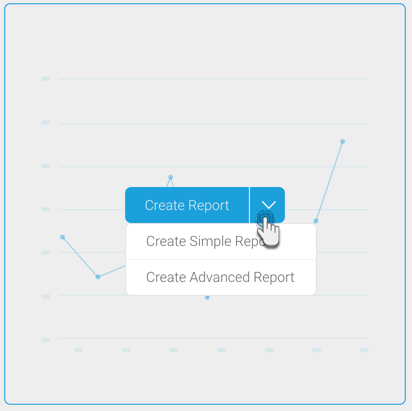
Create Simple Report: This option allows you to create a Quick Chart within the presentation slide.
Create Advanced Report: This allows you to create an advanced report. On doing so, you will exit the presentation and navigate to the report builder in Yellowfin Data Discovery. Create a report as per normal, and publish it. Then close the Report page to jump back into the same presentation where your newly created advanced report will be displayed.
In this tutorial, we’ll be creating a Quick Chart, using the Create Simple Report button. Click on it to bring up the following form.
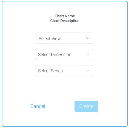
Select a view from the list. Then select a dimension and series (metric) field for the chart.
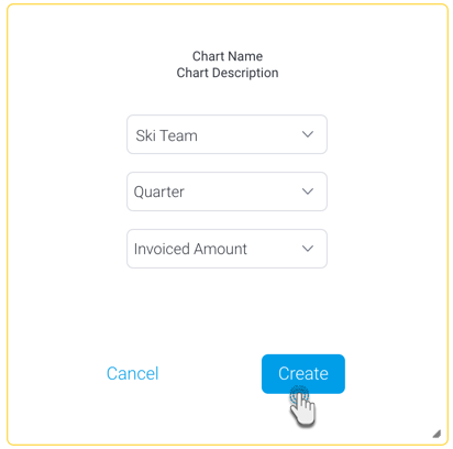
Click on the Create button.
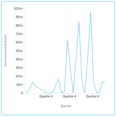
- This will create a simple chart directly on the presentation, as shown in the example below.
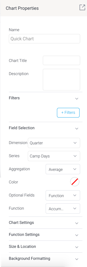
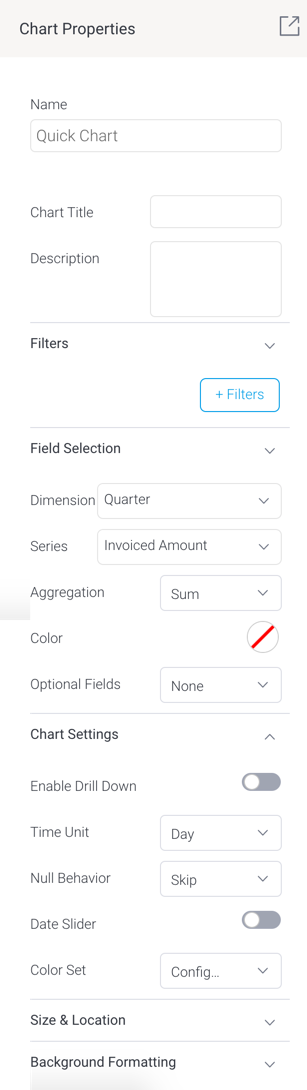
To further configure this chart, open the chart’s property panel, which will display additional fields, which vary for each chart type. Each chart will also differ based on the minimum set of fields to be defined for it.
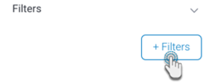
- You can create filters in your Quick Charts. Click on the +Filters button to define a filter condition.
- In the new popup create a filter condition. Upon saving it, the final filter logic will be displayed in the properties panel.
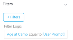
- Note, however, that to display a user prompt filter in the presentation, you will need to use a Filter Widget (see here for how to).
- In the new popup create a filter condition. Upon saving it, the final filter logic will be displayed in the properties panel.
- Expand the Field Selection section and choose the data fields.
Then in the Chart Settings section, define additional settings.
Note Refer to the chart type section below for further details on their specific configurations.
- You will notice your chart autogenerating with each field and configuration you define. You do not require additional steps to save the chart.
- You may update other properties of this widget, such as its size and location on the slide, and background details. See the properties panel for details on all widget properties.
...
Define the following chart fields to generate a meter chart (also called a gauge chart). These are used to measure the rate of change of a measure against pre-defined targets.
Field | Description/Instruction |
|---|---|
Field Selection | |
Measure |
Select a series fields, which serves as your metric or measure field.
The series or metric field that serves as the measure for the meter chart. | |
| Aggregation | Select the type of aggregation to apply to the measure value. ‘Default’ applies the default aggregation applied at the view level to the selected measure field (if any is applied). Other options include:
|
Chart Settings | |
|---|---|
Target type | Allows you to select how to add a target value to the chart, to highlight it through needles or other indicators. Options include:
|
Target value | If Manual target type was selected, then provide the value of the target. |
Target | |
If 'Field' target type was selected as the target type, then choose a data field as the target (must be a numeric field). | |
(Target) Aggregation | Apply an aggregation value on the target field. You can aggregate the values with the following options:
|
Bar chart
Define the following chart fields to generate a horizontal bar chart.
Field | Description/Instruction |
|---|---|
Field Selection | |
Dimension | Choose a dimension field for the chart. |
Series | Select a series fields, which serves as your metric or measurement field. |
| Aggregation |
This is an additional field you may select for a slightly more advanced chart. Note that you may only select one of the following options:
Apply an aggregation value on the primary series. You can aggregate the values with the following options:
| |
| Color | Select a color for the chart. This will be applied to the primary series. |
Optional Fields | This is an additional field you may select for a slightly more advanced chart. Note that you may only select one of the following options:
|
|
| |
Second series | If ‘Second series’ is selected as the optional field, then select a second metric field to be added to the chart. |
(Second |
series) Aggregation | Apply an aggregation value on the second series. You can aggregate the values with the following options:
|
Color set
| |
| (Second series) color | If a second series is specified, then select a color to display this series in. |
Color field | If ‘Color field’ |
is selected as the optional field, then choose a dimension field as the color |
field. | |
Function | If ‘Function’ is selected as the optional field, then select a chart function to be applied. Options include:
|
| |
Chart Settings | |
|---|---|
| Enable drill down | Allows you to enable drill down functionality on the chart. |
Axis type | If the chart has a second series, then you can further configure the axis type. Options include:
|
| |
Date unit | If you have selected a date dimension field, this setting allows you to change the date unit. Note: you cannot select a date unit lower than the unit defined in the view. |
Axis summary | Enable this setting to apply automatic abbreviation to axis labels. This is useful for charts with large numeric values. For example, 10,000,000 will be changed to 10m, making it easier to read. |
Sort |
by | Change the sort order of how dimension values are displayed. Sort these values by: |
|
| |
Sort order | Allows you to choose the sorting direction between ascending and descending.
|
| Trim Values (toggle) | If your selected dimension |
| field contains too many values to the point where it’s difficult to read your chart, |
| enable this |
| toggle to trim or cut out values from the chart. |
Trim Display | If your dimension fields contain too many values to the point where it’s difficult to read your chart, you can use this setting to trim or cut out values from the chart.
|
|
|
|
|
|
Show Other Dimension | Enable this to sum all trimmed out values together and display under an ‘Other’ field. |
Color set | Define the color set of the chart.
|
Trim value
If value trim is enabled, specify the amount of values (N) to be cut out from the chart.
Trim show other bar
Enable this to sum all trimmed out values together and display under an ‘Other’ field.
Color property
Define the color property of the chart.
- Standard: uses standard default colors on chart.
- Monochrome: uses variations of a single color on chart.
Series Formatting
This section allows you to set up formatting of the primary series in the chart.
Color
Specify a color to display the primary/first series in.
Second series Formatting
This section allows you to set up formatting of the secondary series in the chart, if specified.
Color
| |
Function settings | This section allows you to manage settings related to some of the chart functions. |
|---|
Function type | If the accumulation function is enabled on the chart, you can choose whether this value should be displays as the accumulative % of the total line, or the running total. |
Value | If the |
Reference line function is selected, then specify the position of this line by providing the exact value. | |
Label | If |
the Reference line function is selected, then provide its label. | |
Color | If |
the Reference line function is selected, then specify its color. |
...
Blueprint Widget properties
This section covers other properties details of a Blueprint Widget.
| Section | ||||||||||||||||||||||||||||||||||||||||||||||||||||||||||||||||||||
|---|---|---|---|---|---|---|---|---|---|---|---|---|---|---|---|---|---|---|---|---|---|---|---|---|---|---|---|---|---|---|---|---|---|---|---|---|---|---|---|---|---|---|---|---|---|---|---|---|---|---|---|---|---|---|---|---|---|---|---|---|---|---|---|---|---|---|---|---|
| ||||||||||||||||||||||||||||||||||||||||||||||||||||||||||||||||||||