Page History
...
The browse page allows you to explore all the content you have access to in the system. From this central location you can locate individual reports, dashboard tabs, storyboards, and discussion streams in order to interact with them.


Display
| Styleclass | ||
|---|---|---|
| ||
There are two display layouts available for the browse page; a thumbnail and list view. You can toggle which layout you use and it wont effect other users, meaning some users that are more visually minded may choose the thumbnail view, while others will use the text based list view.

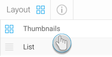
Thumbnails
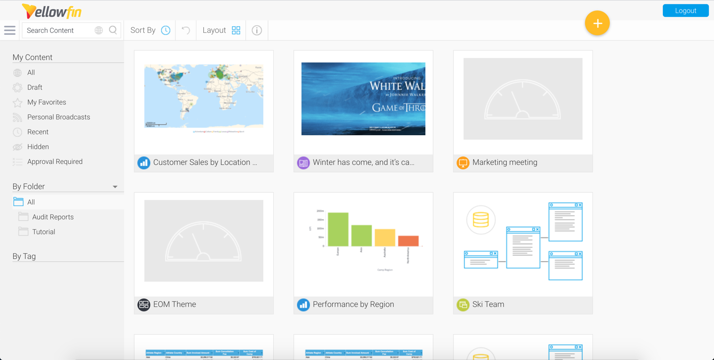
The thumbnail layout allows users to explore their content using a gallery type display. Each piece of content will display a thumbnail, either generated from its display (in the case of reports, stories, and dashboard tabs), from its assigned thumbnail image (in the case of storyboards Present, themes, and discussion streams), or a generic thumbnail icon (in the case of content that hasn't been run yet, or been assigned an image).
List
This list layout allows users to explore their content using a text based display. Each piece of content still has a thumbnail associated with it, but in order to view it the user will have to view content information through the Activity Stream panel. The list view generally allows users to view more pieces of content on the screen at any one time, making bulk action easier to perform.


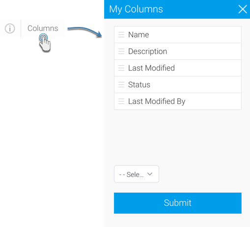
Columns
The list view allows each user to select what information they want to have displayed on the page through the columns menu. As each user interacts and acts on content differently, unique groupings of columns allow them to make the most of this page.

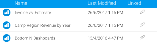
Linked Content
When viewing reports in list mode, you can use the Columns menu to select the Linked option. This displays a link icon next to each report that has related content or drill through reports linked to them. Note that child reports will not show these linkages, only parent reports.

Search
| Styleclass | ||
|---|---|---|
| ||
...
The drop down menu in the search box allows you to restrict the types of content you explore on the browse page.

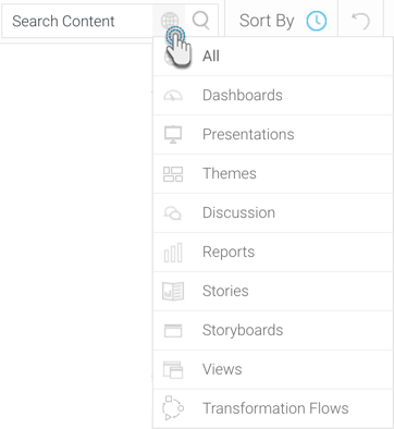
| Content Icon | Content Type | Description |
|---|---|---|

| All | This option allows you to view all types of content available to you, including Dashboard Tabs, Discussion Streams, Reports, and Storyboards. |

| Dashboards | This option restricts the content you're viewing to only the Dashboard Tabs that are available to you. |
| Presentations | This option restricts the content you're viewing to only the presentations that are available to you. |
| Themes | This option restricts the content you're viewing to only the Present themes that are available to you. |
 | Discussion | This option restricts the content you're viewing to only the Discussion Streams that are available to you. |

| Reports | This option restricts the content you're viewing to only the Reports that are available to you. |
| Stories | This option restricts the content you're viewing to only Stories that are available to you. |

| Storyboards | This option restricts the content you're viewing to only the Storyboards that are available to you. Note: This option only appears if there are any Storyboards in your system. This is because Storyboard has been replaced by Present, however existing storyboards can still be viewed, although not modified. |
 | Views | This option filters the browse page tabs to only Views. |

| Transformation Flows | This option filters the browse page tabs to only data transformation flows. |
...
Sort By
The sort by drop down menu allows you to define the property that the content is ordered by on the browse page.


| Sort Icon | Sort Type | Description |
|---|---|---|

| Name | This option arranges the content in alphabetical order based on its name. |

| Recent | This option arranges the content based on the date it was last accessed, from most recent to least. |

| My FavouritesFavorites | This option arranges the content, prioritising any items you have nominated as your favourite favorite first. |

| Comments | This option arranges the content, prioritising items by the number of comments associated with them, with most comments first. |

| Views | This option arranges the content, prioritising items by the number of user views they have, with most viewed first. |
Lists
The My Content list allows you to restrict the items you view in the browse page by some predefined content lists.

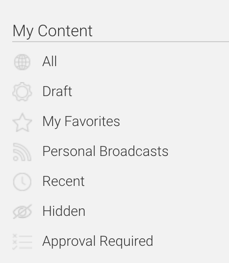
| Content List | Description | ||
|---|---|---|---|
| All | This allows all content that is available to you to be displayed, only restricted by your search, content type, and sort options. | ||
 | Draft | This allows you to restrict the content that is displayed to only draft items, hiding all active content. | |
| My FavouritesFavorites | This allows you to restrict the content that is displayed to only items you have nominated as your favouritesfavorites, hiding all other content. | |
 | Personal Broadcasts | This allows you to restrict the content that is displayed to only reports you have set up a personal broadcast to, hiding all other content. | |
| Recent | This allows you to restrict the content that is displayed to only items that have been accessed in the last x days, hiding all other content. | ||
| Hidden | This allows you to restrict the content that is displayed to only items that have been nominated as hidden from the browse page. Note: requires a specific role permission in order to see and use this function. | ||
 | Approval Required | Shows you only content that required approval. |

...
This option allows you to toggle between browsing content by its storage location and its data source.

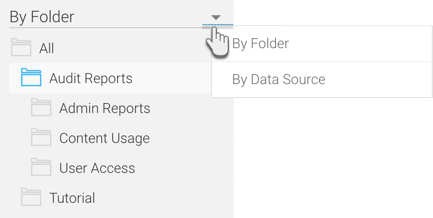
| Parent Type | Description |
|---|---|
| Folder | This allows you to browse content by navigating through the folder structures they're stored in. You will only see folders that you have access to. |
| Data Source | This allows you to browse content by navigating through the data source list. You will only see sources that you have access to. |
See New Folders for information on creating folders via this page.
Actions
| Anchor | ||||
|---|---|---|---|---|
|
...
There are three different mouse actions that can be performed on the browse page in order to interact with content.

| Click | Description |
|---|---|
| Single Click | This will allow you select an item. If you hold down shift or control/command on your keyboard you will be able to select multiple items. |
| Double Click | This will allow you to open a single piece of content from the browse page. Simply double click on the item you wish to open. |
| Right Click | This will allow you to open the menu for content from the browse page. Simply right click on the item you wish to act on. This is an alternative to selecting the item and opening the menu via the triple dots icon |

|
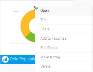
Menu
Selecting one or more items will allow you to then use the triple dots menu icon  to access the content menu and perform actions.


| Action | Content TypeItems | Description | |
|---|---|---|---|
| Open | | Single | This will allow you to open an individual piece of content from the browse page. Alternatively, you can double click on the item to open it. |
| Edit | Single | This will allow you to edit an individual piece of content from the browse page. | |
| Share | Single | This will allow you to share an individual piece of content from the browse page. See Sharing Reports for more information. | |
Add to Dashboard / Remove from Dashboard | Single | This will allow you to add or remove a tab from your personal dashboard. | |
Add to Favourites Favorites / Remove from Favourites | Favorites | Single & Multiple | This will allow you to add or remove individual or multiple items from your favourites favorites list. If this includes dashboard tabs, they will be added or removed from your personal dashboard. |
| Edit Details | Single | This will allow you to edit the details of a piece of content. | |
| Make a copy | Single | This will allow you to make a copy of an individual piece of content from the browse page. | |
| Delete | | Single & Multiple | This will allow you to delete selected pieces of content from the system. |
...
New Folders
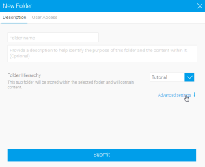
When using the Folders List on the Browse Page you will be able to add new folders when needed. Follow these steps to create a new content folder:
- Hover over an existing folder and click on the
 icon.
icon. - Click on the New option.
- The next step is to define if this is a Folder or a Sub Folder.
- Folder: this is used as a container for Sub Folders, and will never directly hold content. Leave the Folder Hierarchy option set to Top Level (which it is by default).
- Sub Folder: this is used as a container for content, and as such can have security and other content-related settings applied. Select a Parent Folder to place this Sub Folder into.


- Next, you can define your advanced options.

- Folder: there is only one option available for a Folder.
- Sort Order - Define a specific sort order value if you don’t wish the folder to be sorted alphabetically. 0 will result in standard sorting.
- Sub Folder: there are a range of options available for Sub Folders.
- Sort Order - Define a specific sort order value if you don’t wish the folder to be sorted alphabetically. 0 will result in standard sorting.
- Draft Content Default Folder - Define if this folder will be used to store all draft content until it is saved initially. There can only be one of these folders in a system.
- Max Size - Define the amount of storage available for caching content in this folder (in KB).
- Max Versions - Define the number of historical result sets that will be accessible, per report.
- Max Age - Define how long the historical result sets should be stored before they are deleted.
- Folder: there is only one option available for a Folder.
- Finally, if this is a Sub Folder, you can define the User Access settings, otherwise proceed to the last step.


- Expert Approval - Define if publishing into this folder requires approval by an expert.
- Folder Security:
- Unsecure - This option is used in conjunction with a multicast licence and guest login to provide access to content in this folder without logging in. This behaves like a Public folder for users that are logged in.
- Public - All users with functional access to reports, dashboards, and/or storyboards will be able to see the content stored in this folder.
- Private - Only the users specified here will be able to see and interact with the content stored in this folder, based on the level of access specified.
- Click Submit to create your folder.
Content Approval
Content, such as Views or Stories, that require approval, will appear with a 'Approval Required' tag on them in the Browse page.


Content that gets approved will display an approval icon on them to signify their authorization.

To learn more about the View Approval process, click here.
Activity Stream
| Anchor | ||||
|---|---|---|---|---|
|
...
Clicking on the information icon when a single piece of content has been selected will allow you to open the Activity Stream - old, which provides a range of different information related to the content, its event activity, and comments.
See Activity Stream - old for more information.
| horizontalrule |
|---|
| Styleclass | ||
|---|---|---|
| ||
...