Page History
...
| Table of Contents | ||
|---|---|---|
|
Overview
| Styleclass | ||
|---|---|---|
| ||

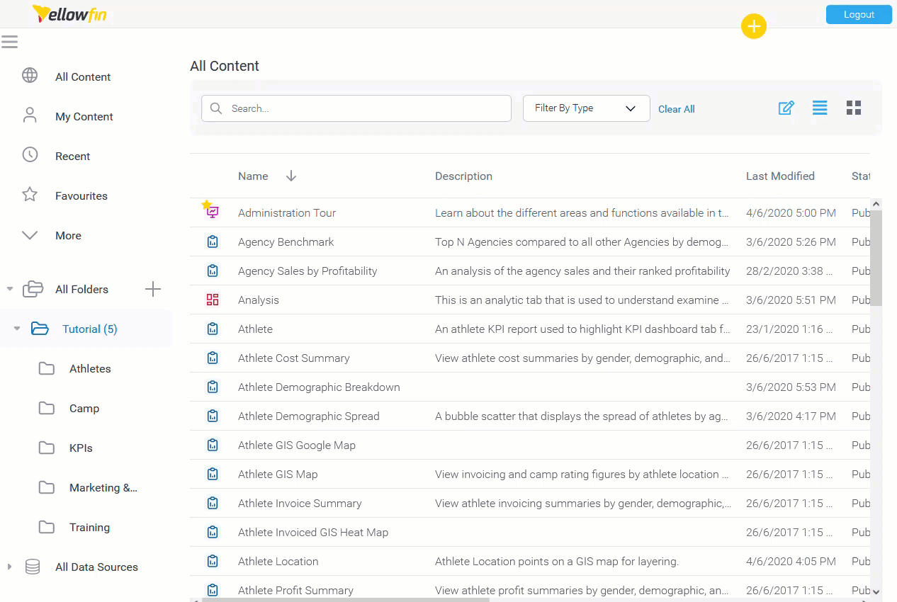
Display
stories, and more depending on your security access level.
Display
| Styleclass | ||
|---|---|---|
| ||

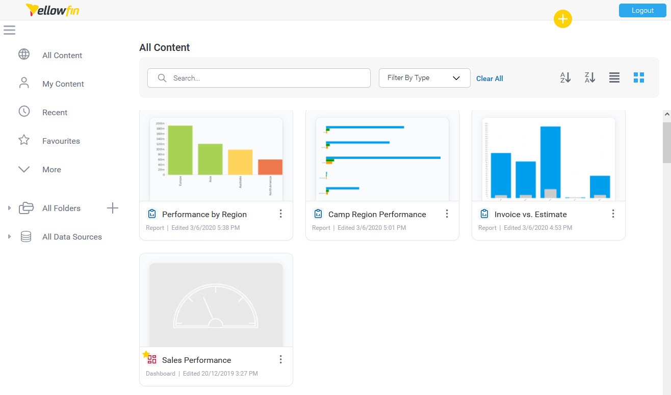
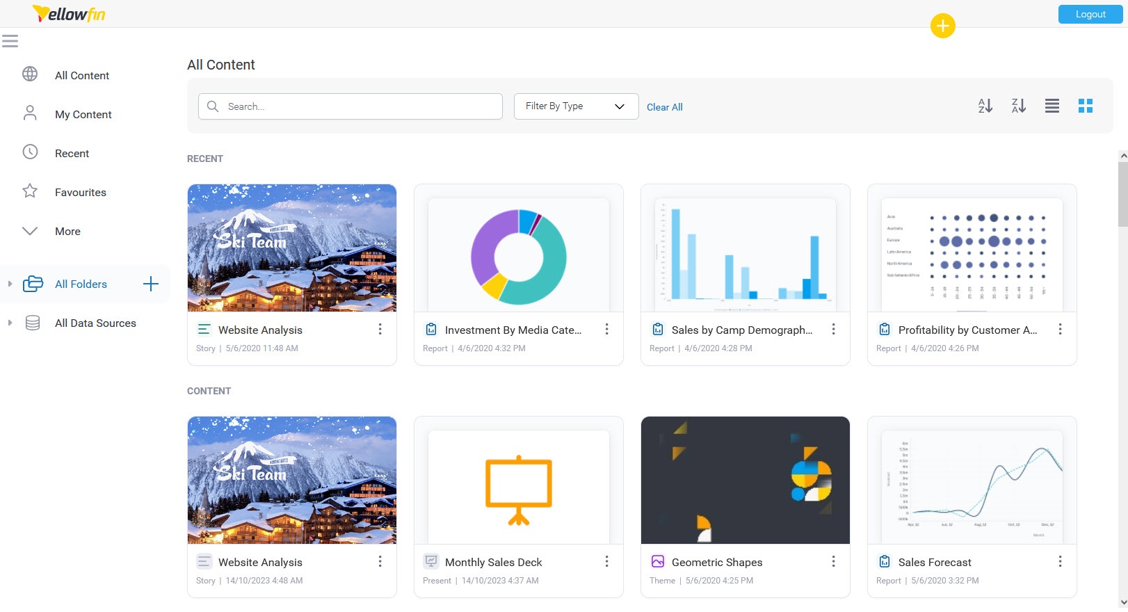
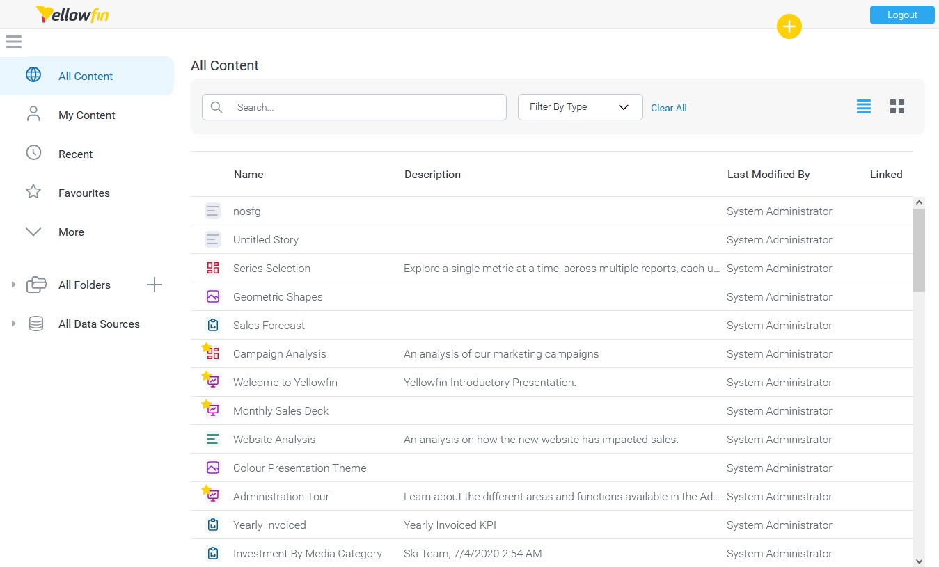
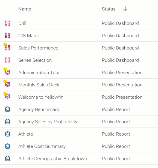
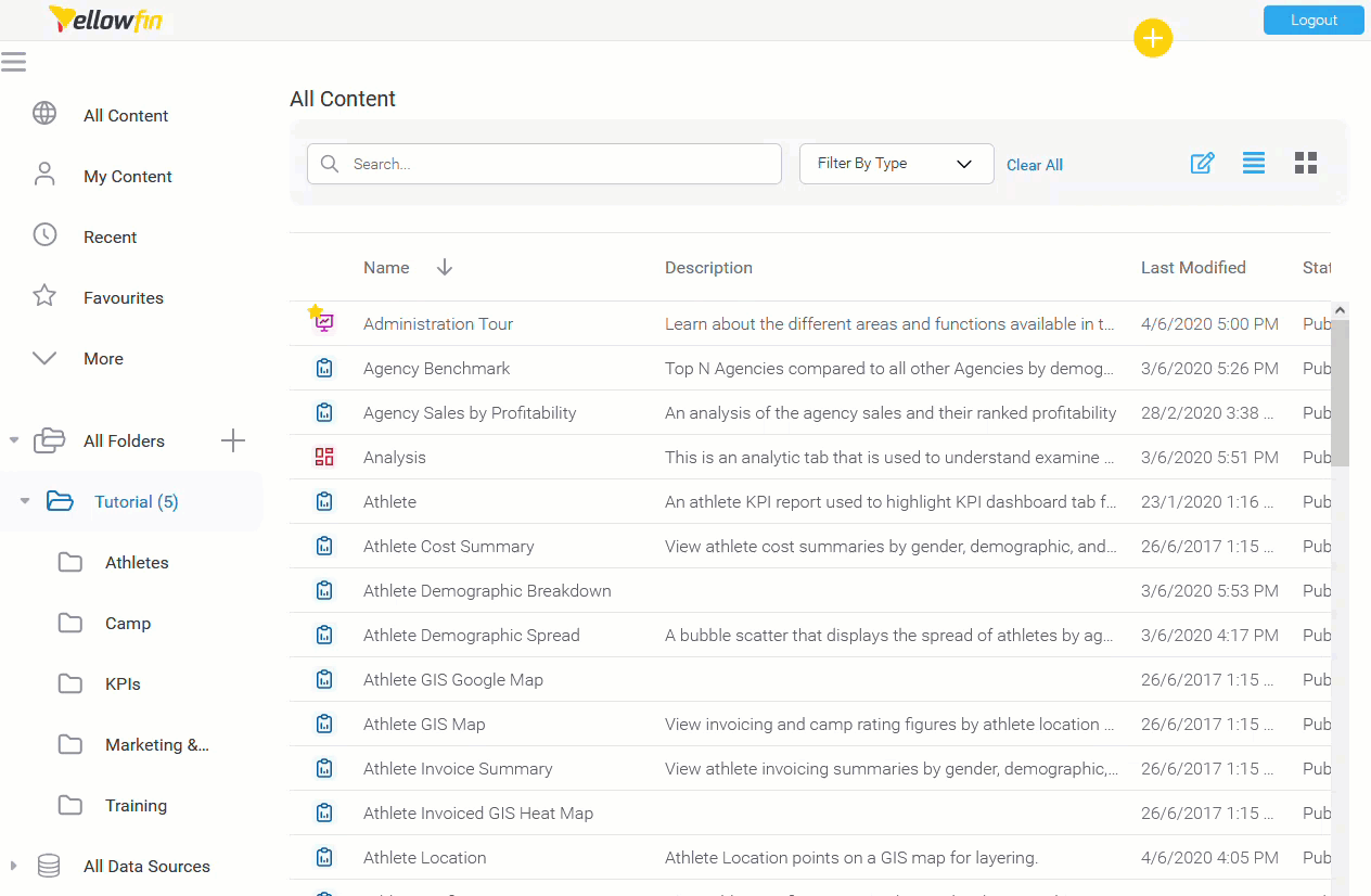
Thumbnails
The thumbnail layout allows users to explore their content using a gallery type display. Each piece of content will display a thumbnail, either generated from its display (in the case of reports and dashboard tabs), from its assigned thumbnail image (in the case of storyboards and discussion streams), or a generic thumbnail icon (in the case of content that hasn't been run yet, or been assigned an image).
List
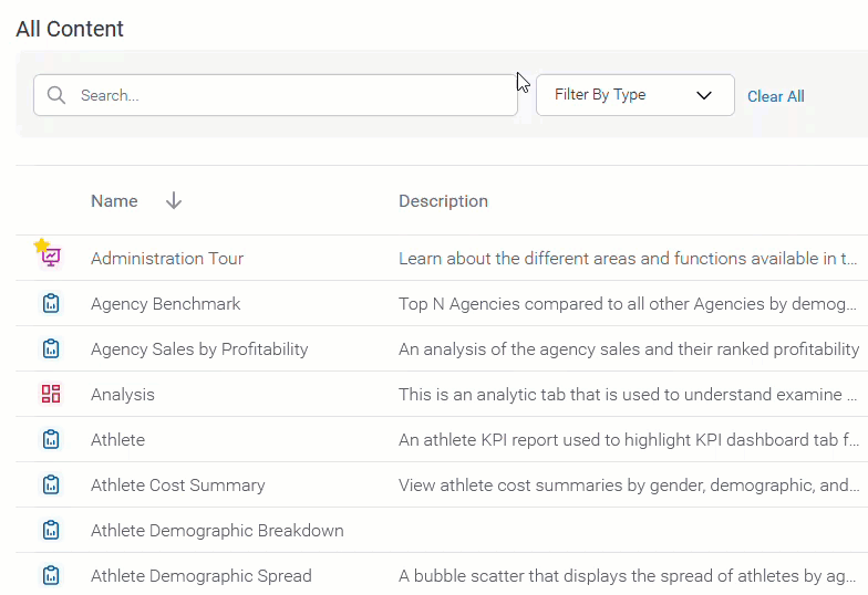
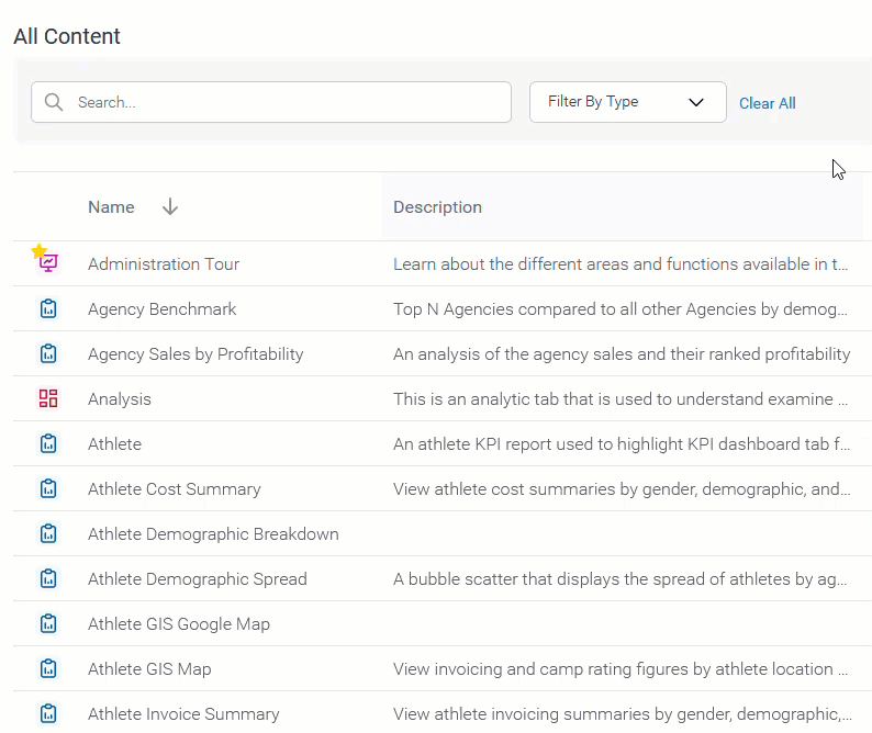
This list layout allows users to explore their content using a text based display. Each piece of content still has a thumbnail associated with it, but in order to view it the user will have to view content information through the activity stream panel. The list view generally allows users to view more pieces of content on the screen at any one time, making bulk actions easier to perform.

Columns
: a List and a Thumbnail View.
In the thumbnail layout, users can sort the content in ascending or descending order.
Thumbnails
Each content item will be represented by a thumbnail. The thumbnail will display an image relevant to the content type, or a default image if the content has not been initialized.
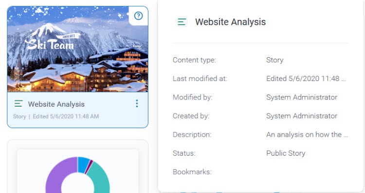
To see more information about an item, you can hover over a thumbnail and click on the  icon on the top right corner.
List
This layout allows users to search for their content using a list. Information about each content item is displayed in columns. Users can also perform bulk actionswhen in list view.
Columns
The List The list view allows each user to select what information they want to have displayed on the page through the columns menuColumns popup. As each user interacts and acts on content differently, unique groupings of columns allow them to make the most of this page.

Search
| Styleclass | ||
|---|---|---|
| ||
Content Types
The drop down menu in the search box allows you to restrict the types of content you explore on the browse page.

| Content Type | Description | |
|---|---|---|
 | All | This option allows you to view all types of content available to you, including Dashboard Tabs, Discussion Streams, Reports, and Storyboards. |
 | Dashboards | This option restricts the content you're viewing to only the Dashboard Tabs that are available to you. |
 | Discussion | This option restricts the content you're viewing to only the Discussion Streams that are available to you. |
 | Reports | This option restricts the content you're viewing to only the Reports that are available to you. |
 | Storyboards | This option restricts the content you're viewing to only the Storyboards that are available to you. |
 | Views | This option filters the browse page tabs to only Views. |
Sort By
The sort by drop down menu allows you to define the property that the content is ordered by on the browse page.

| Sort Type | Description | |
|---|---|---|
 | Name | This option arranges the content in alphabetical order based on its name. |
 | Recent | This option arranges the content based on the date it was last accessed, from most recent to least. |
 | My Favourites | This option arranges the content, prioritising any items you have nominated as your favourite first. |
 | Comments | This option arranges the content, prioritising items by the number of comments associated with them, with most comments first. |
 | Views | This option arranges the content, prioritising items by the number of user views they have, with most viewed first. |
Lists
The My Content list allows you to restrict the items you view in the browse page by some predefined content lists.

| Content List | Description | |
|---|---|---|
| All | This allows all content that is available to you to be displayed, only restricted by your search, content type, and sort options. | |
 | Draft | This allows you to restrict the content that is displayed to only draft items, hiding all active content. |
| My Favourites | This allows you to restrict the content that is displayed to only items you have nominated as your favourites, hiding all other content. |
 | Personal Broadcasts | This allows you to restrict the content that is displayed to only reports you have set up a personal broadcast to, hiding all other content. |
| Recent | This allows you to restrict the content that is displayed to only items that have been accessed in the last x days, hiding all other content. |
 | Hidden | This allows you to restrict the content that is displayed to only items that have been nominated as hidden from the browse page. Note: requires a specific role permission in order to see and use this function. |
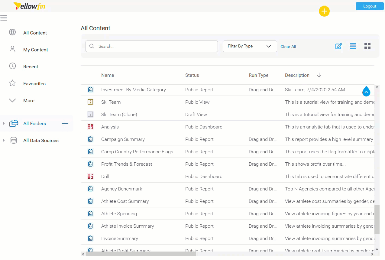
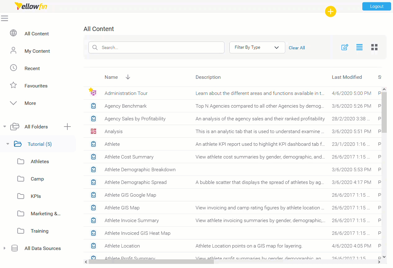
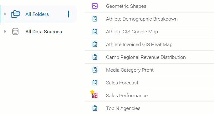
Folders/Data Source
This option allows you to toggle between browsing content by its storage location and its data source.

| Parent Type | Description |
|---|---|
| Folder | This allows you to browse content by navigating through the folder structures they're stored in. You will only see folders that you have access to. |
| Data Source | This allows you to browse content by navigating through the data source list. You will only see sources that you have access to. |
See New Folders for information on creating folders via this page.
organizing Columns lets you be more efficient.
To customize your view, click the 'Edit Columns' icon  on the top right side of the page and select your preferences.
You have several options within the Columns popup:
- Filter columns by typing in the search box.
- Toggle columns on or off using the checkbox next to each column name.
- Rearrange columns by dragging them.
You can also:
- Resize columns to accommodate different information.
- Sort the table by clicking on column headings to toggle between ascending (ASC) and descending (DESC) order.
- Scroll horizontally to view all available data.
Available Columns
| Title | Description |
|---|---|
| Name | Name of content. |
| Description | A summary of what the content is about. |
| Last Modified | Last time it was modified. |
| Status | Displays whether it's a Public or Draft content item. |
| Last Modified By | Name of the user who last modified this item. |
| Linked | Displays a Link icon next to each report that has related content or drill through reports linked to them. Only parent reports show links. |
| Run Time | Provides an indication of how long the content item takes to run. |
| Folder | Name of the Folder where this item is stored. |
| Sub Folder | Name of the Sub Folder where this item is stored. |
| Broadcasts | Indicates if this content item is included in any Broadcast schedules. |
| Run Type | Indicates if a View was created using the Drag and Drop Builder or an SQL statement. |
| Tags | Lists any content tags that have been associated with this item. |
Actions
| Anchor | ||||
|---|---|---|---|---|
|
...
| Styleclass | ||
|---|---|---|
| ||
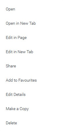
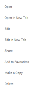
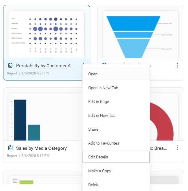
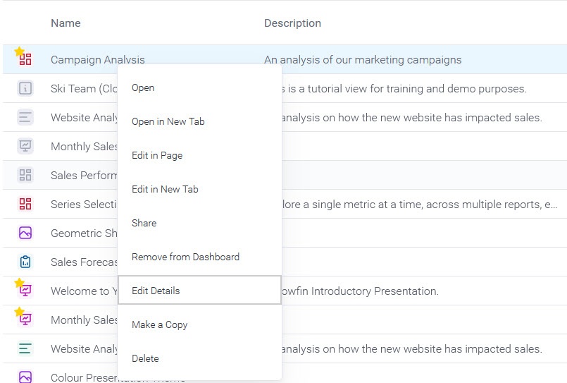
Once you have located the content you require there are a range of actions , you can perform , either various actions—either on a single item or sometimes multiple items.
Mouse Actions
There are three different mouse actions that can be performed on the browse page in order to interact with content.

| Click | Description |
|---|---|
| Single Click | This will allow you to select an item. If you hold down shift or control/command on your keyboard you will be able to select multiple items. |
| Double Click | This will allow you to open a single piece of content from the browse page. Simply double click on the item you wish to open. |
| Right Click | This will allow you to open |
a menu for |
the selected content item or items. Simply right click on the item you wish to |
see the menu for. As an alternative you can select the item and |
open the menu |
 .
.
Menu
Selecting one or more items will allow you to then use the triple dots menu icon to access the content menu and perform actions.

by clicking on the three dot icon |
Menu
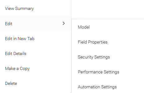
There are different menus, depending on the content item selected. Users may see different menu options on a content item based on the security functions they have for that particular content type and whether it's a "Published" or "Draft" item.
To access the menu for Thumbnail content, right-click anywhere in the tile or click on the three dot icon  on the bottom right side of a thumbnail tile.

To access the menu when in list view, right-click on the content item row.
Published Content Menus
| Dashboards - Presentations - Reports | Stories | Themes | Views |
|---|---|---|---|
|
|
|
Check the following links to learn more about: |

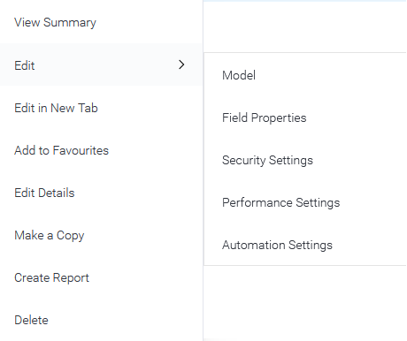
Drafts Content Menus
| Dashboards - Presentations - Reports | Stories | Views |
|---|---|---|
|
|
|
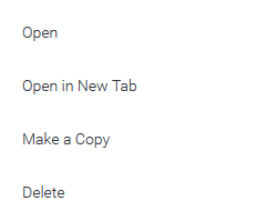
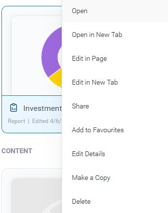
| Action | Description | ||
|---|---|---|---|
| Open | Allows you to open an individual content item | ||
| Action | Content Type | Items | Description | Open | | Single | This will allow you to open an individual piece of content from the browse page
| . Alternatively, you can double click on the item to open it. | Edit |  | |
| Open in new tab | Allows you to open the content in a new tab. Note that you must have the multi tab support enabled for this. | ||
| Edit in Page | |||
| This will allow you to edit an individual | |||
| content | |||
| item in the | |||
| current page. | Share | | Single|
| Edit in New Tab | This will allow you to edit the content in a new tab. Note that you must have the multi tab support enabled for this. | ||
| Share | This will allow you to share an individual piece of content from the browse page. See Sharing Reports for more information | Add to Dashboard / Remove from Dashboard | | Single | This will allow you to add or remove a tab from your personal dashboard
| . | |||
Add to Favourites | |||
| | Single & Multiple | ||
This will allow you to add | |||
individual or multiple items | |||
to your favourites list. If this includes | |||
Dashboards, they will be added | |||
from your personal | |||
dashboards list. | |||
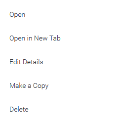
| Edit Details | |||
| Single | |||
| This will allow you to edit the details of a | |||
| content item. | |||
| Make a copy | | Single | |
| This will allow you to make a copy of | |||
| Delete | | Single & Multiple | This will allow you to delete selected pieces of content from the system. |
New Folders
When using the Folder List on the Browse Page you will be able to add new folders when needed. Follow these steps to create a new content folder:
...
| a content item. | |
| Delete | This will allow you to delete one or more content items. |
| Anchor | ||||
|---|---|---|---|---|
|
Open in new tab
If you have the Multi-Tab Support configuration enabled, click on the menu of any content in the Browse page, and you will have additional options to open or edit that content in a new tab. You can also bring up the menu by right-clicking on the content thumbnail.
| Anchor | ||||
|---|---|---|---|---|
|
Edit Details
The Edit Details option allows you to change general information about a content.
To Edit Details from a Thumbnail view, right-click anywhere in the tile or click on the three dot icon  on the bottom right side of a thumbnail tile.
To Edit Details from a list view, right-click on the content item row.
In the popup dialog, users can edit the Title, Description, Folder and Subfolder of a content.
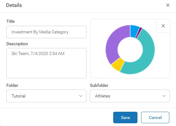
Users can also reset the thumbnail image and set it to a default picture.
Deleting Content
When you delete content from the system, a number of different warning messages can be displayed, these are described below.
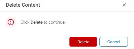
- If the content item or items being deleted does not have dependencies, the user will simply be asked to confirm the delete.
- If the content item is a View, and that View has been used by other content (most commonly a Report), those Reports will be automatically deleted when the View is deleted. The user is shown the following warning including a list of the impacted Reports.
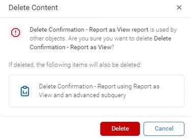
Further, if those Reports are themselves used by other content,a variation of the above warning will be displayed.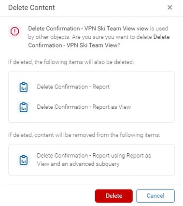
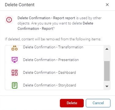
- When a user attempts to delete a Report that is used by other content (such as included on a Dashboard or in a Story), the warning will list the content that is currently using that Report.
Search
| Styleclass | ||
|---|---|---|
| ||
When searching for content on the browse page, the search can be refined by entering text in the Search box and pressing enter or clicking the magnifying glass to start the search. To clear the text in the Search box, simply click the  icon on the right side of the bar or click on Clear All.
Filter By Type
The drop down menu allows you to restrict the types of content on the page.
There are different options to filter your view:
- To select all or no content types, toggle all categories on or off.
- To select one or more content items, toggle all categories to off, then select the content types you need.
- The view will update automatically 3 seconds after you make your selection, or when you close the drop down by clicking on the arrow or clicking anywhere outside the drop-down.
- Clear all will default back to All Categories, clear the search bar and refresh the view, including resetting any sorting applied.
Filtering Options
The Filtering Options on the left side, allows you to define the content view on the browse page, restricting the items you can view. The different options work in combination with the Search bar and Content Type Filter.

| Sort Icon | Sort Type | Description |
|---|---|---|
| All Content | Allows all content that is available to you to be displayed, only restricted by your search and content type. |
| My Content | Allows users to filter the view to content they created or last modified. |
| Recent | Arranges the content based on the latest date it was viewed. |
| Favourites | Arrange the content by displaying only items you have selected as your favourites. |
| Drafts | Allows you to restrict the content that is displayed to only draft items, hiding all active content. |
| Hidden | Allows you to restrict the content that is displayed to only items that have nominated as hidden from the browse page. Note: Requires a specific role permission in order to see and use this function. |
| Broadcasts | Allows you to restrict the content that is displayed to only reports you have set up with a personal broadcast, hiding all other content. |
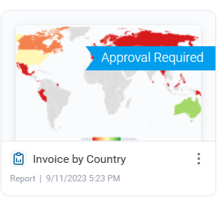
| Approval Required | Shows you only content that requires approval. |
| Anchor | ||||
|---|---|---|---|---|
|
Folders/Data Source
Users have the option to view either the 'Folders' or 'Data Sources' sections.
Browsing by Folder
To filter the current view, users can expand the folder hierarchy and select a folder or sub-folder.
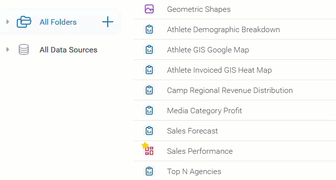
Browsing by Data Sources
To filter the current view, users can expand the Data Sources hierarchy and select a view.
New Folders
This feature is available for users with the permission to create or edit folders.
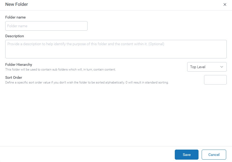
You can add new folders From the "All Folders" section on the left side.
- Click on the
 icon.
icon. Define the Folder Hierarchy, select Top Level (Folder).
Note that Folders are used as a container for Sub folders
...
- , and will never directly hold content. Leave
...
- the Folder
...
- Hierarchy option set
...
- to Top Level (which it is
...
- the default).
Sub Folder:
...
- This is used as a container for content, and as such can have security and other content-related settings applied. Select
...
- a Parent Folder to place
...
- the Sub
...
- folder.
...
- Sort Order - Define a specific sort order value if you don’t wish the folder to be sorted alphabetically. 0 will result in standard sorting.
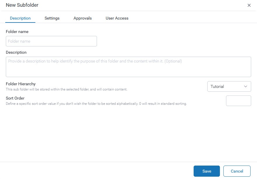
Complete the Sub folder window with the required fields.
Description Tab
Folder name - Enter a Folder name.
Description - Enter a description to identify the purpose of the folder.
Folder Hierarchy - Select either Top Level folder (to leave this as a parent folder) or choose a top level folder to be the parent folder (to make the new folder a sub-folder).
Sort Order - Define a specific sort order value if you don’t wish the folder to be sorted alphabetically. 0 will result in standard sorting.
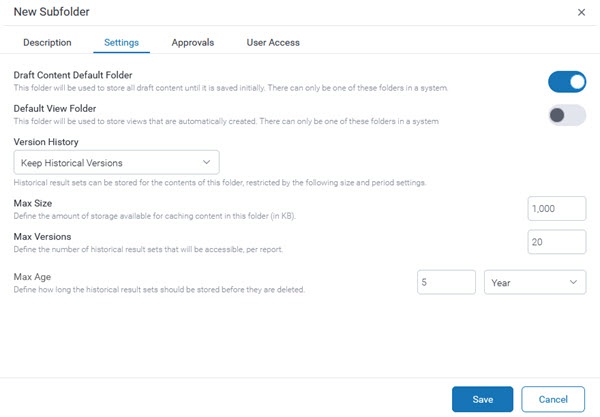
Settings
Draft Content Default Folder - Define if this folder will be used
...
- as the default folder for storing draft content until it is
...
- activated. There can only be one default folder to save draft content in the system. Turning this on will deactivate that setting for any other folder.
Default View Folder - Define if this folder will be used to store views that are automatically created. There can only be one
...
- folder to save draft views in a system.
Version History - Choose whether to save historical result sets for the contents of this folder (in which case the following settings can also be defined), or save only the current version.
Max Size - Define the amount of storage available for caching content in this folder (in KB).
Max Versions - Define the number of historical result sets that will be accessible, per report.
Max Age - Define how long the historical result sets should be stored before they are deleted.
...
Approvals
Request for Expert Approval - Define if publishing into this folder requires approval by an expert.
If this is enabled, you need to define who can approve content for this folder. To select an expert approver, you can enter the name of a user or a user group in the box or you can click on the drop-down list.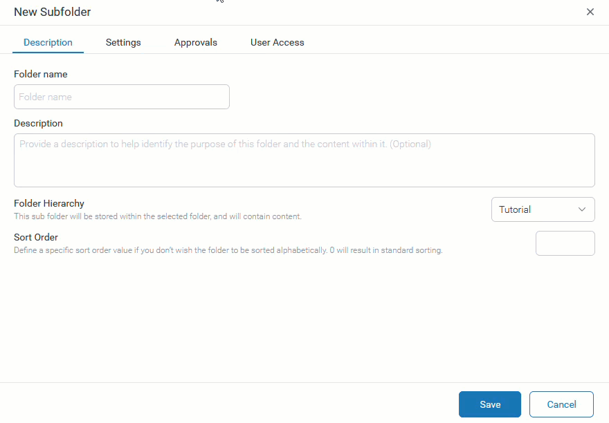
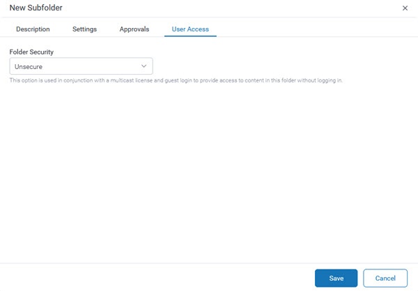
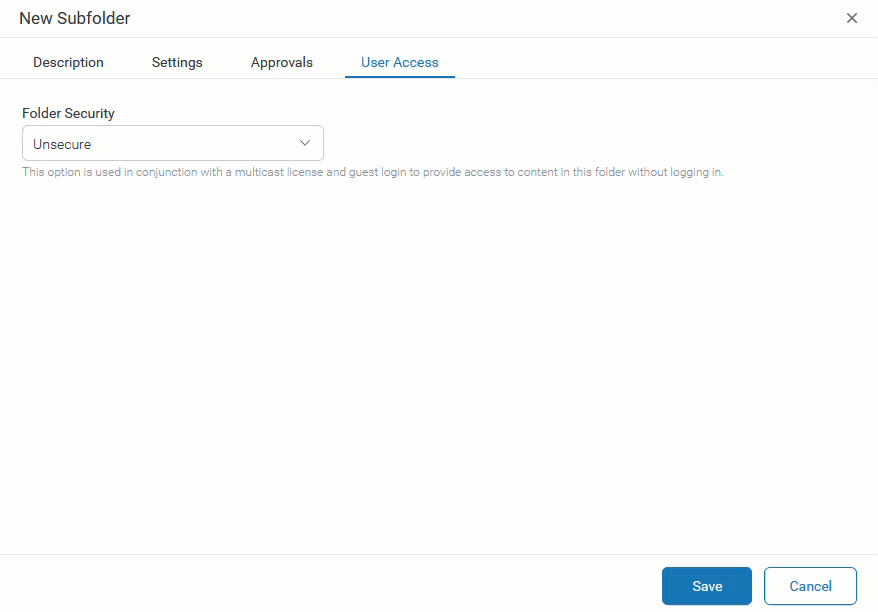
User Access
Folder Security:
...
Unsecure -
...
- This option is used in conjunction with a multicast
...
- license and guest login to provide access to content in this folder without logging in. This behaves like a Public folder for users that are logged in.
Public -
...
- All users will be able to see the content stored in this folder.
Private -
...
- Only the users
...
- selected here will be able to see and interact with the content stored in this folder, based on the level of access specified.
...
- Users can have access to Edit, Read, and Delete.
- Click Save
...
- to create your folder.
Activity Stream
| Styleclass | ||
|---|---|---|
| ||
See Activity Stream for more information.
Edit Folders
To Edit a Folder or Sub Folder, users can click on the triple dots menu icon  next to the Folder or Sub Folder name and click on Edit Settings.
Content Approval
Content, such as Views or Stories, that require approval, will appear with a 'Approval Required' tag on them in the Browse page.
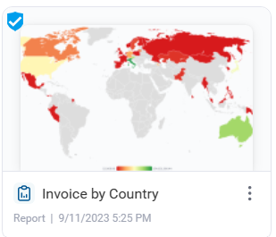
Content that gets approved will display an approval icon on them to signify their authorization.
To learn more about the View Approval process, click here.
| horizontalrule |
|---|
| Styleclass | ||
|---|---|---|
| ||
...