Create Reports
Learning Outcomes
After completing this section, you will be able to:
- Create Column and Cross Tab Reports
- Create multiple types of Charts, including Numeric Display, Column, Ring, Line, and Stacked Bar Charts
- Use a Drill Down
- Apply Conditional Formatting
- Construct a Multi-Chart Canvas with text and Charts
- Add a Sub Query with linked filters
- Create an Advanced Function
- Link Reports to apply a Drill Through
About Reports
Reports empower you to explore, communicate, and visualize data effectively, leading to more informed decision making. A variety of interactivity can be added to reports including filtering, unit selection, and drill downs.
The report builder uses an intuitive drag and drop interface, making it easy for you to design and build Charts and Tables.
Additional Learning: See more information on Reports.
Getting Started Invoice Summary Report
This section will guide you through creating a Report displaying “Invoiced Amount” by “Gender”, “Demographic”, and “Region”.
- Click the Create
 button and select “Report”.
Note: If you don’t see the Create button in the top right corner, open the Burger Bun. You’ll see a yellow Create option. Open and select “Report”.
- Select the “Getting Started View” you created earlier in the View section.
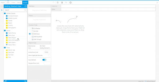
You are taken to the Report Builder Data section. On the left panel are the folders you created in the Preparing the View section. When you click on a folder, you’ll see each field you selected in the View section.
Additional Learning: See more information on the Report Builder Data section and fields.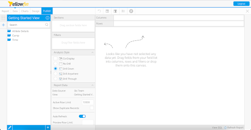
There are three types of table layouts available:
Column | The most common form of Table output, all fields added are displayed as a column in the table layout, with the field name used as the column header. |
Row | A variant of the column layout, all fields added are displayed as a row in the table layout, with the field name used as the row header. |
Cross Tab | A special layout that allows you to summarize data by using both Column and Row headers with Metric fields making up the body of the table. This display is sometimes referred to as a Pivot. |
Create a Cross Tab Report
First, create a Cross Tab Report that shows “Invoiced Amount” by “Region” and “Month, Year”.
- Open the “Time” folder. Drag and drop “Month, Year” onto the canvas.

Note: When you drop a field into the canvas, it automatically becomes a column. You can also drag the field into the Columns section above the canvas for the same output.
- Drag and drop “Region” into the Rows section. Then, drag “Invoiced Amount” into the Columns section.
Note: You could drag the metric, “Invoiced Amount”, to either the Columns or Rows section for the same output.
Note: Notice when you drag in “Invoiced Amount”, it is automatically aggregated into a sum and shown as “Sum Invoiced Amount”. This default aggregation was set in the View. It is possible to change the aggregation in individual Reports using column formatting.
Change the column name from “Sum Invoiced Amount” to “Invoiced Amount”. - Click on the arrow on the “Sum Invoiced Amount” column heading.
- Hover over Format and select “Edit”.
- Rename the Display Name to “Invoiced Amount”.
Note: The Display Name appears as “Invoiced Amount” in the Column Formatting window. Either retype “Invoiced Amount” into the Display Name section or add and delete a space after “Invoiced Amount”.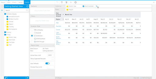
Now that you’ve created a Cross Tab Report and are familiar with dragging and dropping fields into the canvas, let’s move on to create more complex Reports.
Create a Column Report
Now we will be building Tables with Column layouts.
Note: For all the remaining Reports, you can drag and drop fields into either the Columns section or the canvas. The Reports won’t use the Rows section.
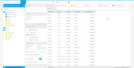
- Drag “Region” between “Month, Year” and “Invoiced Amount”.

This Report now has a Column layout, with one row per month per region.
- Drag in “Gender” and “Demographic” from the “Athlete Details” folder. Place them in between “Region” and “Invoiced Amount”.

Add User Prompt Filters
Filters can be added to a Report to limit the data returned in the report. Filters can either be set when the report is being built, or they can be set by users when they are using the report.
In this example, you will add User Prompt filters, which allow consumers of the Report (not just Report builders) to adjust the filters and manipulate the data displayed.
- Drag and drop “Year” and “Gender” into the Filters section.
Notice the filter icon that has appeared on the right panel.
- Select
 and select “Female” for the “Gender” filter. For the “Year”, choose between “01/01/2015” to “01/01/2017”.
 - Click Apply and the content in the Table will update to match the filters you have selected.

Select Reset on the filter panel to reset the Report to show the default values. We haven’t set any default values so all values will be displayed.
Note: Even if you publish the Report with user prompt filters selected, the filter values won’t save. If you want the Report data to always only show a certain subset, use Defined Filters.
Additional Learning: See more information on filters and filter formatting.
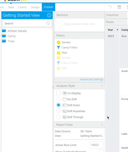
Use a Drill Down
Notice the “Region” values are hyperlinked, which indicates a Drill Down is enabled for this field. The Drill Down is composed of the Region to Country hierarchy defined in the View.
Note: If your “Region” column does not show blue text hyperlinks, make sure that under Analysis Style, “Drill Down” is selected. If it is enabled and the “Region” column still isn’t hyperlinked, check that you’ve properly configured your hierarchy in the Preparing the View section.
- Interact with the Drill Down by clicking on “Europe” in one of the rows. The column changes to show only European countries.
To show all the regions again, select “Start” in the breadcrumbs above the Table.
Continue to create visualizations using the fields in your Table.
Additional Learning: See more information on Drill Downs.
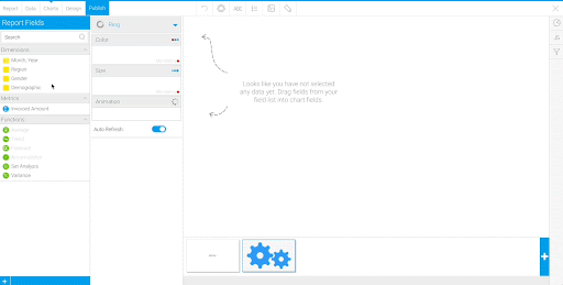
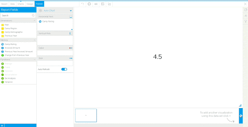
Create a Numeric Display Chart
- Select the Charts tab, in-between the Data and Design tabs.
The fields you added into your Table appear in the Report Fields section on the left.
- Drag in “Invoiced Amount” to the Horizontal Axis section.
When you drag in fields to the Axes and Color sections, Auto Chart selects the most appropriate Chart based on the fields that have been selected. Here, Auto Chart creates a Numeric Display Chart using the sum of the “Invoiced Amount” column.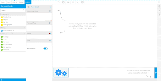
- Move to the Design section.
The Design section previews the Report as it would be displayed to users.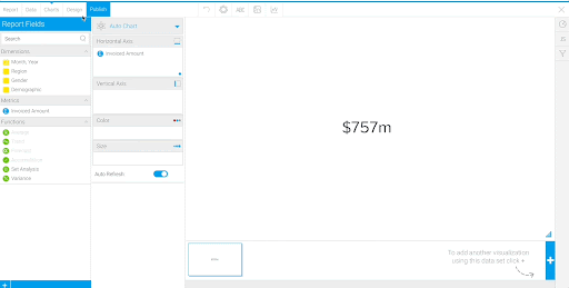
Notice that the Chart you created has appeared above your Table. - Return to the Charts tab.
In the next few sections, you will create multiple types of Charts within this Report.
Additional Learning: See information on the Chart Builder and the Design Builder settings.
Create a Ring Chart
- Click
 on the bottom right to add another Chart to this Report.
Note: Each Chart you create will share the same data from the Report query you created in the Data section.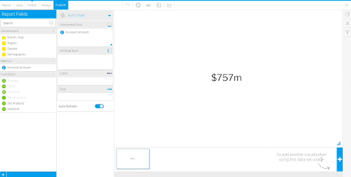
Here, you will select the type of Chart instead of using Auto Chart. - Click on the Pie Chart
 icon in the top right corner.
You’ll see a list of Charts you can create using the simple Chart Builder.
Note: Instead of clicking, you can click the arrow on “Auto Chart” to open the same panel of Chart options.
Note: You can also build custom Charts with Javascript if your desired visualization isn’t listed. - Select the Ring option in the Pie section.
Notice that instead of “Auto Chart”, the Chart Type now displays as “Ring”. Instead of Horizontal Axis and Vertical Axis, there are Color and Size sections. - Drag and drop “Gender” in the Color section and “Invoiced Amount” in the Size section.
You have many options available to change the look of Charts using the top panel . Use the icons to add a legend and hide the data labels on the Ring Chart.
 - Select the Legend
 icon.
icon. - Change the Legend Position to “Right”.
- Select the Labels
 icon.
icon. - Change the Show/Hide Data Labels to “Hide”. Close the window.
The Chart will now have a legend on the right side and no labels. Tooltips still give you the exact invoiced amount and percentage if you hover over the Chart.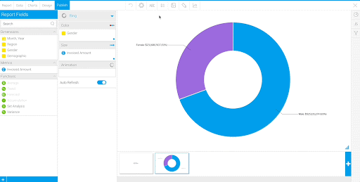
Note: Using the Chart settings, you can change the look of the Charts beyond adding legends and removing labels. You have the option to make changes such as removing background lines, editing axis titles and defining Chart areas.
Additional Learning: See more information on Chart Formatting.
Repeat the steps to create another Ring Chart showing Invoiced Amount by Demographic.
- Click on the bottom right to add another Chart to this Report.
- Click on the Pie Chart
 icon in the top right corner.
 - Select the Ring option in the Pie section.
- Drag and drop “Demographic” in the Color section and “Invoiced Amount” in the Size section.

The colors defined in the “Demographic” Reference Code can be applied in Charts. Applying Reference Code colors creates consistency in dimensional values across multiple Charts and Reports.
Use the Reference Code to apply custom colors to the Ring Chart. - Right click or select the drop down on “Demographic” in the Color section.
- Hover over Color and select “Reference Code”.
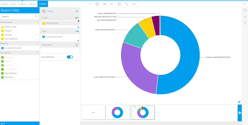
Now the colors of the Chart are the colors defined in the “Demographic” Reference Code.
Change the settings to match the “Gender” ring Chart. - Select the Legend icon.
- Change the Legend Position to “Right”.
- Select the Labels icon.
- Change the Show/Hide Data Labels to “Hide”. Close the Labels window.
Create a Column Chart
Next, create a column Chart showing “Invoiced Amount” by “Region”.
- Click on the bottom right to add another Chart to this Report.
- Drag and drop “Region” in the Horizontal Axis section and “Invoiced Amount” in the Vertical Axis section.
The column Chart is generated using Auto Chart. There is no need to specify the Chart type here.
Create a Time Series Chart
Lastly, create a line Chart that plots “Invoiced Amount” over time.
- Click on the bottom right to add another Chart to this Report.
- Drag and drop “Month, Year” in the Horizontal Axis section and “Invoiced Amount” in the Vertical Axis section.
The line Chart is generated using Auto Chart.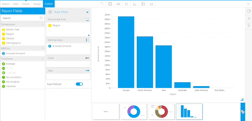
Note: You can navigate to other Charts you’ve built in the Report by clicking on the thumbnails on the bottom of the Chart Builder.
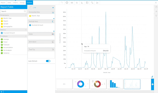
The horizontal axis shows “Invoiced Amount” by month, but the company would like to also Chart “Invoiced Amount” by quarter and year.
Instead of creating separate Charts with different date granularities, you can use unit selection to allow users to change the time units displayed in the Chart.
If you select the gear above the Chart, the sections shown are Size & Position and Style.
To enable Interactions, we need to specify the type of Chart.
Note: Not all chart settings are available when a Chart is created using Auto Chart. To see all settings for a chart generated with Auto Chart, it is necessary to convert the chart to a specific Chart Type. The image below demonstrates the different settings available in an Auto Chart in comparison to a more specific type of Chart, such as a Line Chart.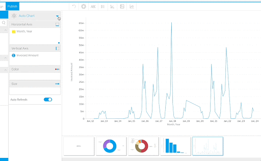
- Using the left panel, change the Chart Type from “Auto Chart” to “Line”.
The Chart looks identical, but there are now settings available that are specific to Line Charts. - Select the gear above the Chart.
The Interaction section is now available. - Under Interaction, toggle on “Visible Unit Selection”.

When this Chart is placed in a Dashboard or Multi-Chart Canvas, you will be able to choose to plot over Month, Quarter, or Year.
Additional Learning: See more information on interacting with Reports.
You’ve created 5 Charts within this Report. Next, combine the Charts with text to create a Multi-Chart Canvas.
Create a Multi-Chart Canvas
With a Multi-Chart Canvas, you can display multiple types of content together, such as Charts, text, and images. You can add Multi-Chart Canvases to Dashboards, Stories, and Presentations.
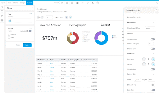
- Return to the Design section.
Notice that your Numeric Display Chart is not appearing on the design like it did previously in this tutorial. When you add multiple Charts to your Report, the Design section will show a blank Multi-Chart Canvas. You can add Charts to the Multi-Chart Canvas one by one.
Note: Your charts do not need to be added to the Multi-Chart Canvas to be added individually to any dashboard, story, or presentation. - In the Chart Properties Panel, under Canvas Size, enter “1,000” as the Canvas Size Width. Toggle on Lock Size.
Using the icons on the left of the canvas, you can drag in the Charts you’ve built in this Report, as well as text boxes, shapes, and images. - Click the Pie Chart icon. Drag in the Numeric Display Chart.
To align or place objects on the Canvas, you can adjust the exact position of the objects in the Properties left panel. Under the Size & Location section, you can change the position, width, and height of any object. This can also be done by dragging and resizing the object in the Canvas. - Under Chart Properties, open the Size & Location section. Input the following coordinates and dimensions:
X: 0 Y: 57
Width: 250 Length: 200 - Open the Text
 section and drag in the “Header 2” text box.
 - Type “Invoiced Amount” in the text box.
- Switch the Alignment to Center.
- Under Text Properties, open the Size & Location section. Input the following coordinates and dimensions:
X: 0 Y: 25
Width: 250 Length: 50 - Repeat this process of adding the Charts and titles in a row. Add the Demographic Ring Chart, Gender Ring Chart, and Column Chart. Add titles using “Header 2” text boxes.
Don’t add the Line Chart. You will add this to your dashboard separately.
Your Multi-Chart Canvas should look something like this: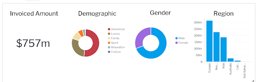
Now that you have completed the Charts and Multi-Chart Canvas, you’re ready to publish the Report. - Click Publish next to the Design section.
- Enter “Getting Started Invoice Summary” as the Report Title.
- Place it in the “Getting Started with Yellowfin” Folder and “Content” Sub-Folder.
- Save the Report.
Additional Learning: See more information on saving Reports.
Getting Started Camp Summary Report
Next, create a Report that will help Ski Team analyze their ski camps performance across regions and demographics.
- Click the Create
 button and select “Report”.
 - Select the “Getting Started View”.
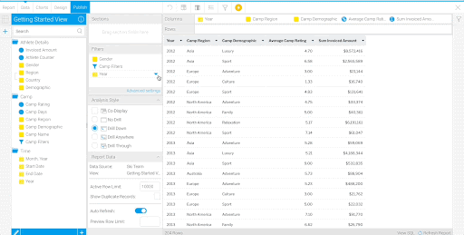
- Drag in “Year”, “Camp Region”, “Camp Demographic”, “Camp Rating”, and “Invoiced Amount”.
Add Defined Value Filters
The filters included in the “Getting Started Invoice Summary” Report were User Prompt, meaning all users can adjust the filters independently.
In this Report, you’ll add filters, but define them within the Report, so the Report is always restricted to the same result subset.
- Add “Year”, “Camp Filters”, and “Gender” to the Filters section.
You’ll keep the “Camp Filters” and “Gender” as User Prompt filters, but define the “Year” filter to only show camps that have taken place in the last year.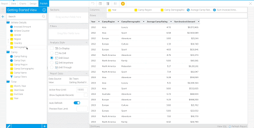
- Right click the “Year” filter.
When you drag a field into the Filters section, it defaults as a User Prompt filter. To hard-code a filter value in your report, you need to change the filter setting, as well as specify the desired filter values. - Hover over Value, and select “Define Value”.
- Enter the following settings for the Defined Value:
Toggle on Dynamic Dates
Current Date - 1 Years
Current Date + 0 Years - Select Submit.
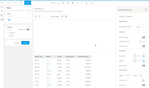
Format Columns
Again, change the column name from “Sum Invoiced Amount” to “Invoiced Amount”.
- Click on the arrow on the “Sum Invoiced Amount” column heading.
- Hover over Format and select “Edit”.
- Rename the Display Name to “Invoiced Amount”.
Change the column name from “Average Camp Rating” to “Camp Rating”.
- Click on the arrow on the “Average Camp Rating” column heading.
- Hover over Format and select “Edit”.
- Rename the Display Name to “Camp Rating”.

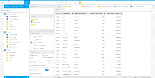
Next, format the Table to make it easier to read by suppressing duplicate values for the “Year” and “Region” columns.
- Click the arrow on the “Year” column heading.
- Hover over Format and select “Edit”.
- Toggle on Suppress Duplicates.
Repeat to suppress duplicates for the “Region” column as well.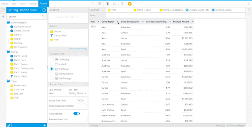
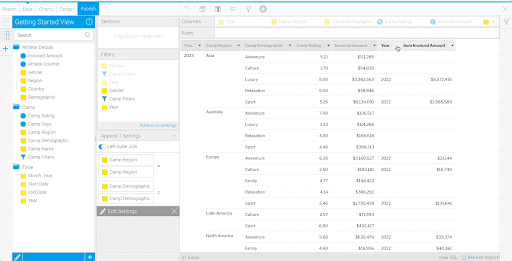
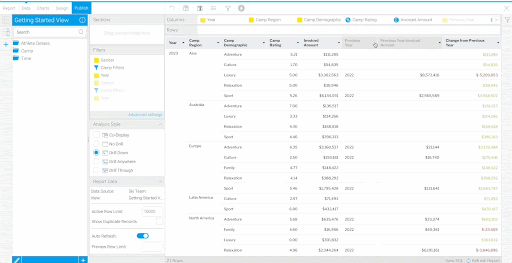
Create a Basic Append Sub Query
Ski Team wants to compare the current year’s “Invoiced Amount” to that of the previous year. The Report currently has a column showing the current year’s “Invoiced Amount”. Add a Sub Query to add a column showing the previous year’s “Invoiced Amount”.
- Click the button to add a Sub Query. Choose the “Append” type, and “Basic” style.
Additional Learning: See information on the different types of Sub Queries.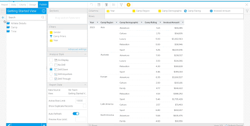
Join on the “Region” and “Demographic” fields.
- For both the Master Query Fields and Sub Query Fields, choose “Camp Region”.
- Select
 to add another join.
 - For both the Master Query Fields and Sub Query Fields, choose “Camp Demographic”.

- Drag in “Camp Filters”, “Year”, and “Gender” to the Sub Query Filters section.
- Click Save.

If a Report Reader filters for “Camps” in “Europe”, the entire Report should be filtered, including the fields in the Sub Query.
First, link the “Gender” filter. - Select “Advanced Settings” in the Filters section.
- Move to the “Append 1” tab.
- Select “Link to Filter” for the “Gender” filter. Select “Define Link”.
- Choose “Same Operator” as the Gender Operator.
- Choose “Gender” as the Link to Filter. Click Submit.

As is the case with the “Gender” filter, the entire Report should be filtered when either of the “Camp Filters” are updated.
- Under Link Filter Groups to Sub Queries, select “Link to matching sub query filter groups”.
By enabling this, you are linking the “Camp Region” and “Camp Demographic” filters in the “Camp Filters” group to the respective Sub Query filters.
Repeat the process to link the “Year” filter. However, instead of linking the filters to show the same values, you’ll offset the filter by a year.
- Select “Link to Filter” for the “Year” filter. Select “Define Link”.
- Choose “Same Operator” as the Year Operator.
- Choose “Year” as the Link to Filter and make the Offset “-364 Days”. Click Submit.

- Close the window. Your changes will save automatically.
- Select the Sub Query
 tab on the left side.
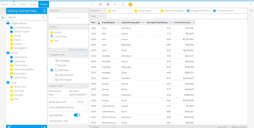
 - Add the “Year” and “Invoiced Amount” fields to the Report.
Now, when a camp has an “Invoiced Amount” value in the previous year with the same Region and Demographic as in the current year, that amount is displayed in the “Invoiced Amount” column in the Sub Query.
- Click on the arrow on the “Year” column heading in the Sub Query.
- Hover over Format and select “Edit”.
- Rename the column title to “Previous Year”.
- Click on the arrow on the “Invoiced Amount” column heading in the Sub Query.
- Hover over Format and select “Edit”.
- Rename the column title to “Previous Year Invoiced Amount”.
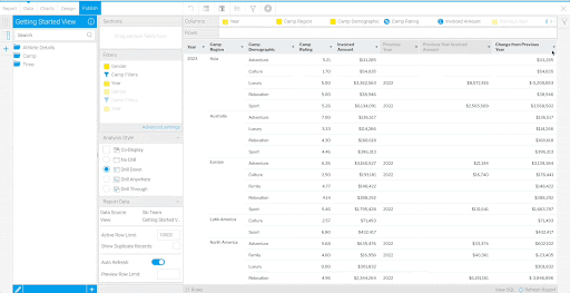
Create an Advanced Function
Advanced Functions allow you to apply statistical, analytical, or text functions to columns. Here, you’ll use the analytical “Difference Truncate” function to calculate the difference between the “Invoiced Amounts” among camps between the two years.
- Navigate to the Master Query
 tab.
tab. - Add a second “Invoiced Amount” column to the Report.
Note: You will apply the Advanced Function to this second “Invoiced Amount” column in the Master Query.
- Click on the arrow on the “Invoiced Amount” column heading.
- Select “Advanced Function”.

- Select “Difference Truncate” from the list of Analysis functions.
- Use “Previous Year Invoiced Amount” as the Metric Column. Click Save.
- Rename the “Difference of Invoiced Amount” column to “Change from Previous Year”.

Additional Learning: See more information on Advanced Functions.
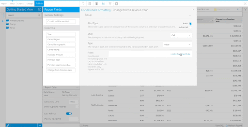
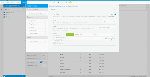
Apply Conditional Formatting (Cell)
Conditional Formatting helps users interpret the data presented to them. Report Writers can define rules to change the color or appearance of the data in Tables and Charts.
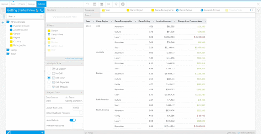
Change the text color of the “Change from Previous Year” column to indicate whether the camp made more or less money than the previous year.
- Click on the arrow on the “Change from Previous Year” column heading.
- Hover over Format and select “Conditional Formatting”.
- Select “Basic” as the Alert Type, “Cell” as the Style, and “Value” as the Type.
- Select “+ Add Another Rule”.
If the column value is positive or zero, make the text color green.
- Choose Greater than or equal to as the operator and enter “0” as the threshold.
- For the Style, make the text color green. Click Submit.

- Select “+ Add Another Rule”.
If the column value is negative, make the text color red.
- Choose Less than as the operator and enter “0” as the threshold.
- For the Style, make the text color Red. Click Submit.
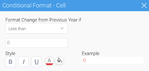
- Close the window. The coloring will be reflected in the “Change from Previous Year” column.
Additional Learning: See more information on Conditional Formatting.
Next, hide fields that may be confusing to other users.
- Click on the arrow on the “Previous Year” column heading.
- Select “Hide Field”.
- Click on the arrow on the “Previous Year Invoiced Amount” column heading.
- Select “Hide Field”.
Now that the Table is complete, create a couple Charts to visualize Camp performance.
Create a Numeric Display Chart
Create a Numeric Display Chart showing the “Average Camp Rating”.
- Move to the Charts section.
- Drag and drop “Camp Rating” in the Horizontal Axis section.
Create a Stacked Horizontal Bar Chart
Create a bar Chart that compares “Invoiced Amount” between “Camp Region” and “Camp Demographic”, using “Camp Region” as the Horizontal Axis, and “Camp Demographic” as the Color.
- Click on the bottom right to add another Chart to this Report.
- Open the Pie Chart icon in the top right corner.
- Select “Stacked Horizontal Bar” from the Bar options.
- Drag and drop “Invoiced Amount” in the Horizontal Axis section and “Camp Region” in the Vertical Axis section.
- Drag and drop “Camp Demographic” in the Color section.

Additional Learning: See more information on Bar Charts.
Now that you have completed the Table and Charts, you’re ready to publish the Report.
Note: Instead of creating a Multi-Chart Canvas in this Report, you will add the Table and Charts to your dashboard individually.
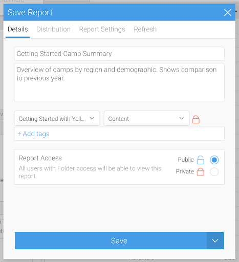
- Click Publish next to the Design section.
- Enter “Getting Started Camp Summary” as the Title.
- Enter “Overview of camps by region and demographic. Shows comparison to previous year.” as the Description.
- Place it in the “Getting Started with Yellowfin” Folder and “Content” Sub-Folder.
- Save the Report.
Getting Started Camp Details Report
- Click the Create button and select “Report”.
- Select the “Getting Started View”.
- Drag in “Camp Region”, “Camp Name”, “Camp Days”, “Camp Rating”, and “Invoiced Amount”.
Add Filters
- Drag in “Camp Filters”, “Gender”, and “Year” to the Filters section.

- Click on the arrow on the “Year” filter.
Similar to the “Getting Started Camp Summary” Report, restrict this Report to only show camps that have taken place in the last year.
Hover over Value, and select “Define Value”. - Enter the following settings for the Defined Value:
Toggle on Dynamic Dates
Current Date - 1 Years
Current Date + 0 Years - Select Submit.

Format the Columns
Remove the aggregate labels from the “Average Camp Days”, “Average Camp Rating” and “Sum Invoiced Amount” column names.
- Click on the arrow on the “Average Camp Days” column heading.
- Hover over Format and select “Edit”.
- Rename the Display Name to “Camp Days”.
- In the Column Formatting window, move to the “Average Camp Rating” section.
- Rename the Display Name to “Camp Rating”.
- In the Column Formatting window, move to the “Sum Invoiced Amount” section.
- Rename the Display Name to “Invoiced Amount”.

Format the Table to make it easier to read by suppressing duplicate values for the “Camp Region” column. - Click on the arrow on the “Camp Region” column heading.
- Hover over Format and select “Edit”.
- Toggle on Suppress Duplicates.

Add a Total to the “Invoiced Amount” column so readers can see the total sum of the column. - Click on the arrow on the “Invoiced Amount” column heading. Hover over Totals and select “Sum”.
Now, at the bottom of the Table, the sum of all invoiced amounts is visible.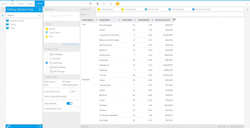
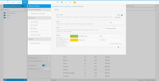
Apply Conditional Formatting (Bar)
To better visualize the “Camp Ratings”, add Conditional Formatting again, this time using a colored bar indicator.
- Right click on “Camp Rating” column heading.
- Hover over Format and select “Conditional Formatting”.
- Select “Basic” as the Alert Type, “Bar” as the Style, and “Percentage of Max” as the Type.

- Select “+ Add Another Rule”.
If the column value is greater than 65, make the bar color green. - Choose Greater than as the operator and enter “65” as the threshold.
- For the Style, make the bar color Green. Click Submit.

- Select “+ Add Another Rule”.
If the column value is between 35 and 65, make the bar color yellow. - Choose Between as the operator and enter “35” and “65” as the thresholds.
- For the Style, make the bar color Yellow. Click Submit.
- Select “+ Add Another Rule”.
If the column value is less than 35, make the text color red. - Choose Less than as the operator and enter “35” as the threshold.
- For the Style, make the text color Red. Click Submit.
- Close the Conditional Formatting window.
- Click Publish next to the Design section.
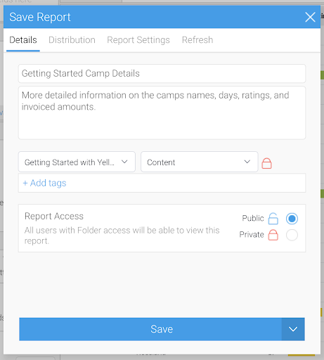
- Enter “Getting Started Camp Details” as the Title.
- Enter “More detailed information on the camp names, days, ratings, and invoiced amounts.”
- Place it in the “Getting Started with Yellowfin” Folder and “Content” Sub-Folder.
- Save the Report.
Create a Drill Through
Return to “Getting Started Camp Summary” Report. In this section, you’ll link the “Getting Started Camp Details” Report to the “Getting Started Camp Summary” Report.
Ski Team wants to click on an “Invoiced Amount” in the “Getting Started Camp Summary” Report and get a detailed breakdown of the camps invoicing that amount. This can be achieved using a Drill Through. Drill Throughs allow you to connect two reports together and drill from one to the other.
- Click on the Burger Bun
 . Open the Browse section and continue to the Browse All page.
 - Use the search bar at the top left corner to search for “Getting Started Camp Summary”.

- Edit the “Getting Started Camp Summary” Report by right clicking on the Report and selecting “Edit”.
Note: There is more than one way to edit a report. You can also edit a Report by opening the Report - either by double clicking on the Report or right clicking and selecting “Open”. From there, you can select the “Edit” button on the top left corner and choose which section of the Report builder you would like to be directed to.
Note: When you edit a Report, the below warning will pop up. The message describes that you will be editing a draft version of the Report, so if you need to delete the version you are editing, the version in production will not be altered.
Additional Learning: See more information on Editing Reports.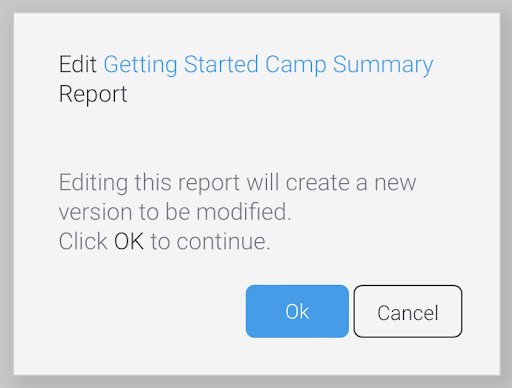
- Select “Ok” in the Edit Getting Started Camp Summary Report pop-up window.
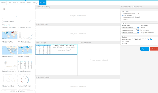
- In the Analysis section, select “Drill Through”.
Notice the Related Content section that appears between the Chart and Design sections when you select “Drill Through”.
- Click on the Related Content section.
- Search for the “Getting Started Camp Details” Report in the left hand panel.
- Drag the Report in the Drill Through section.

- Keep the Join Type as “Drill Through”.
The filters shown under Child Filter reflect the available User Prompt filters in the “Getting Started Camp Details” Report.
- From the Master Field, match the “Camp Region” and “Camp Demographic” from the list of fields. Select the “Gender” from the list of filters.
- Select “Invoiced Amount” as the Hyperlink field.
- Select “Popup New Window”. Select Update.
- Navigate to the Design tab.
- Scroll down to see the Table with the hyperlinked “Invoiced Amount” field.
- Click on values in the “Invoiced Amount” column to see a breakdown of the camps that make up the “Invoiced Amount” totals.
Notice that the column total of the “Invoiced Amount” column in the “Getting Started Camp Details” Report is equal to the hyperlinked value selected in the “Getting Started Camp Summary” Report.
Additional Learning: Drill Throughs can be applied to Charts as well. This will be demonstrated in the Dashboard section.
- Publish the Report.
In the next section, you will build a Dashboard using these three Reports and their Charts.